
Dandymen
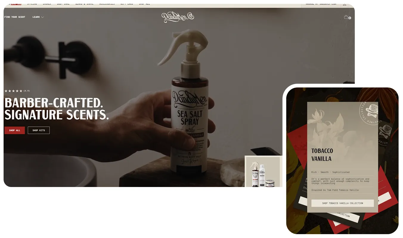
We partnered with DandyMen to rethink how premium men's grooming is sold online, positioning the range as barber-crafted, scent-led essentials for men who want salon-grade results at home.
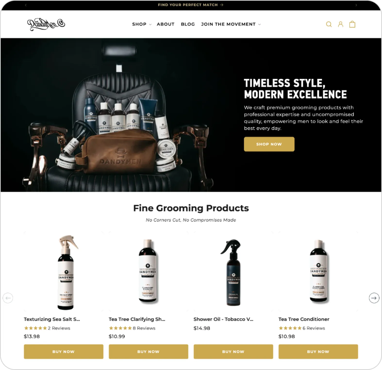
The old store looked like every other grooming shop online. Strong, barber-made products sat behind generic positioning, a plain product grid, and a light template that gave shoppers no reason to choose DandyMen over anyone else. Great products, quietly undersold.
We rebuilt the experience around a sharp barber-crafted identity, a guided way to find the right scent, and proof placed exactly where doubt shows up. The result is a clearer value proposition, less friction on the path to purchase, and a premium presentation that finally matches the price on the bottle.
Process
Undifferentiated Positioning
The homepage led with vague lines like "Fine Grooming Products" and "Uncompromised Quality." Nothing told the shopper what made DandyMen different, so first-time visitors had no clear reason to buy instead of bouncing to a competitor.
Unguided Product Discovery
Visitors were dropped straight into a product grid with "Buy Now" buttons. Anyone who did not already know the range had to figure it out alone, creating decision friction and drop-off exactly where new buyers are most unsure.
Premium Price, Budget Presentation
A light, centered, template-driven layout undercut the premium positioning. The visual system did not justify the price point, weakening perceived value at the moment of decision.
Barber-Crafted Positioning
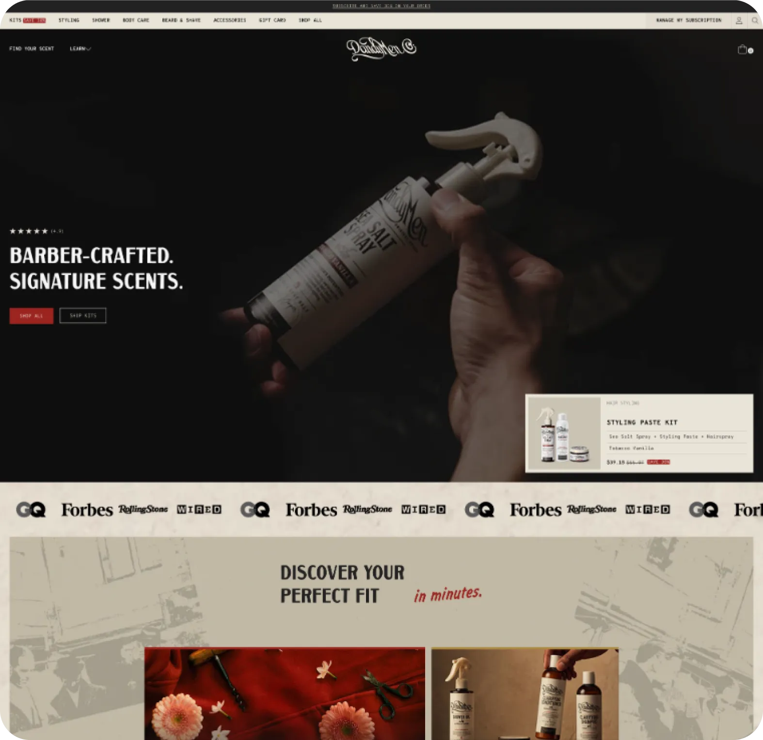
The new hero leads with a single, ownable idea: barber-crafted, signature scents. In the first few seconds a shopper understands who the brand is, why it exists, and why it is different. Positioning does the selling before the product grid ever loads.
Guided "Find Your Fit" Discovery
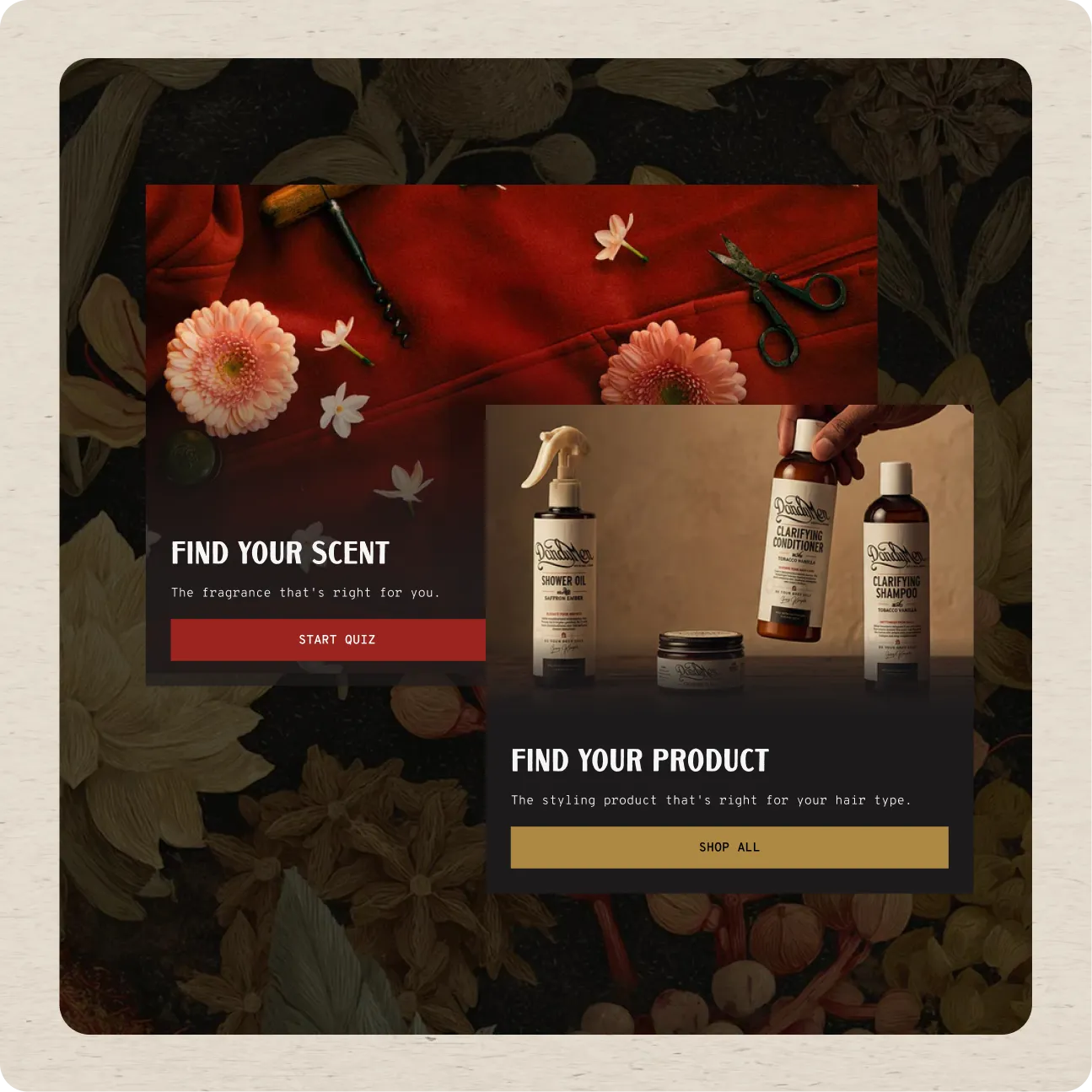
A scent and product finder replaces the cold grid dump. Undecided browsers get a low-commitment, guided path to the right product in minutes, cutting cognitive load and converting traffic that the old grid used to lose.
Front-Loaded, Layered Proof
Press logos, a 5,000+ kits sold marker, and named video testimonials sit high on the page, right where hesitation happens. Proof is stacked to remove doubt early, not buried at the bottom where most shoppers never scroll.

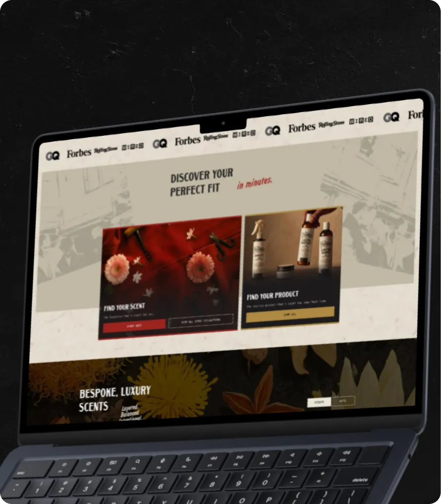
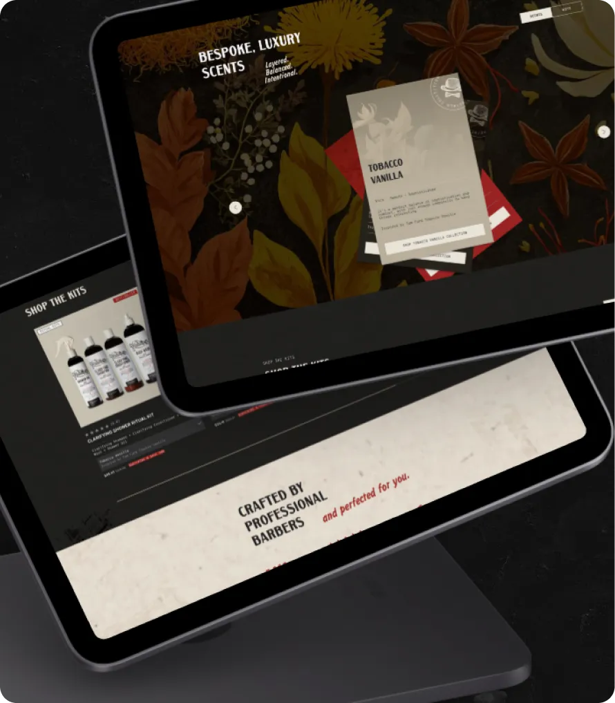
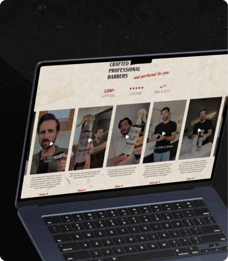
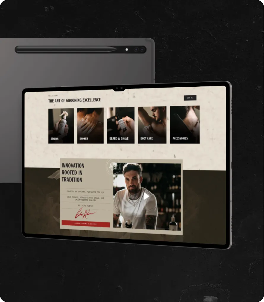
The DandyMen store was rebuilt around one clear promise: barber-crafted grooming, made by professionals, chosen for you. Instead of a flat product grid, the new structure moves shoppers from positioning, to a guided finder, to proof, so the decision feels made for them rather than left to them.
.webp)
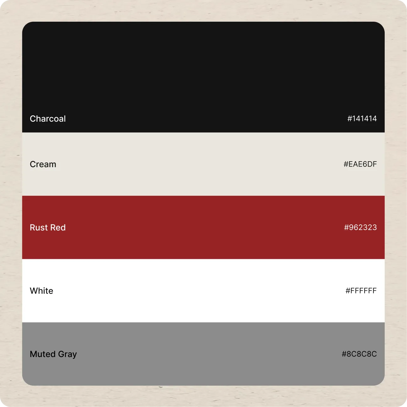
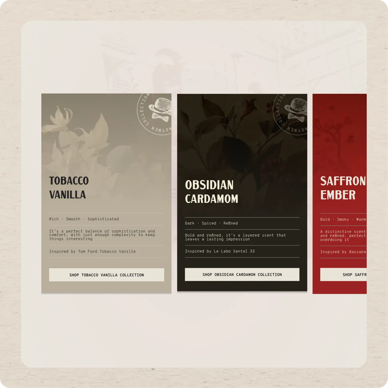
A dark, editorial visual system anchors the brand. Rich product photography, botanical scent imagery, and confident display type create desire and impact, while a clean layout keeps benefits, scents, and kits scannable at a glance. The presentation now signals premium, so the price feels earned.
Bundled kits and a stacked review layer do the heavy lifting on conversion. Starter kits raise average order value and simplify choice for new buyers, while press features and real customer video reviews turn skepticism into confidence at the exact point of purchase.


.webp)
"Honestly, our old site did the products a disservice. We had five-star reviews and real barbers behind every formula, and none of that came through. Charly rebuilt it into something that actually feels like us. The scent finder alone changed how people shop, and for the first time the site looks as premium as what is inside the bottle. First month after launch our conversion was up and returns dropped, because people finally buy the right scent the first time. It just works."