
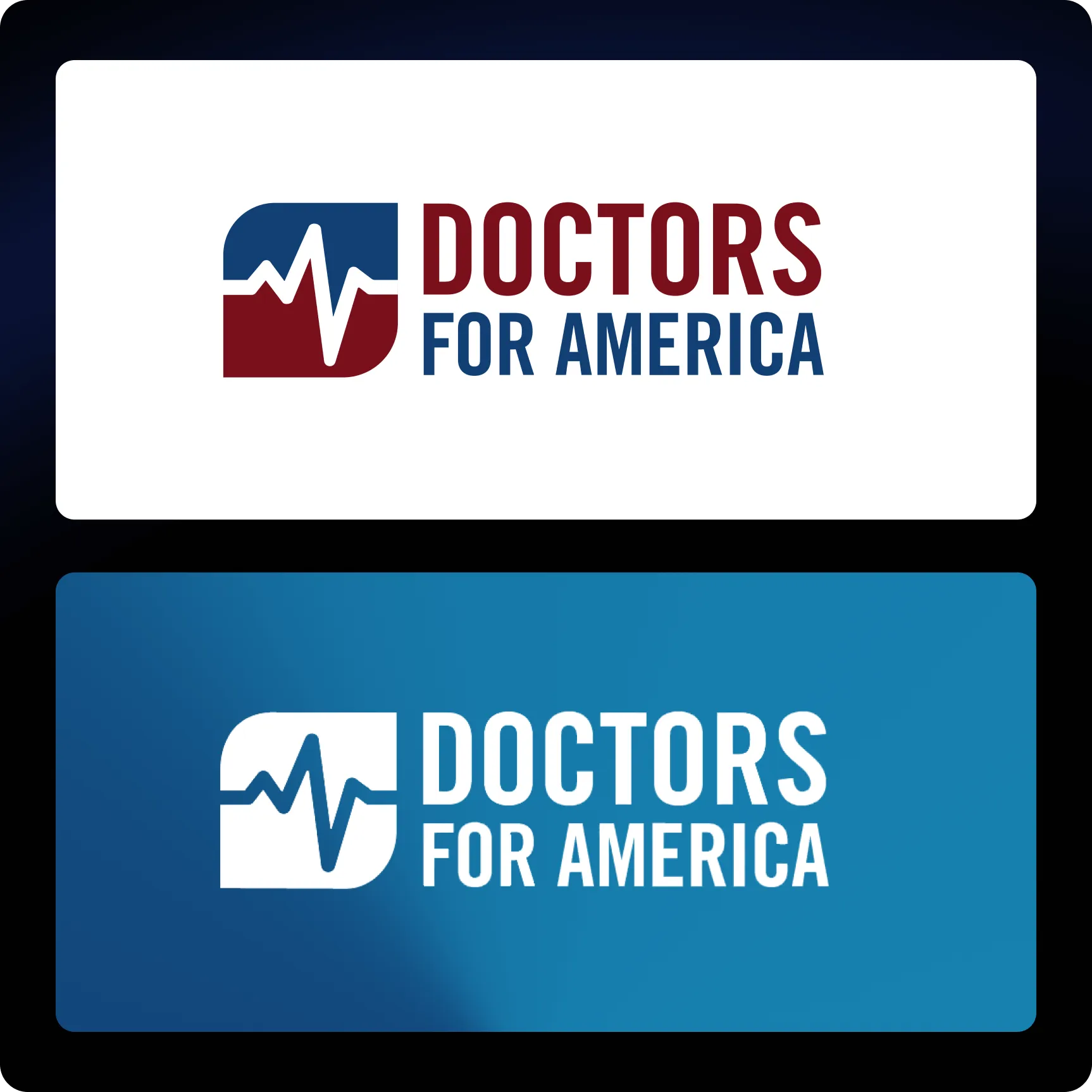
Doctors for America
We partnered with Doctors for America (DFA) to reimagine their digital presence and better reflect the energy of a physician-led national movement advocating for equitable healthcare.
DFA needed a website experience capable of clearly communicating its mission while engaging a wide community of clinicians, trainees, and advocates.
Our objective was to transform their platform into a dynamic digital environment that balances clarity, credibility, and emotional impact.
Through strategic visual direction and thoughtful web design, we delivered a revitalized experience that strengthens DFA’s voice and amplifies its mission.
Process
Brand Expression Lacked Energy
The previous digital presence felt visually flat and lacked the emotional resonance needed to reflect the urgency and impact of DFA’s mission.
Typography Lacked Hierarchy and Cohesion
Type styles were inconsistent and disconnected, making it difficult to establish clear hierarchy and readability across key sections.
Color System Felt Underutilized
The existing palette was applied in a limited and static way, missing opportunities to create depth, contrast, and visual engagement throughout the interface.

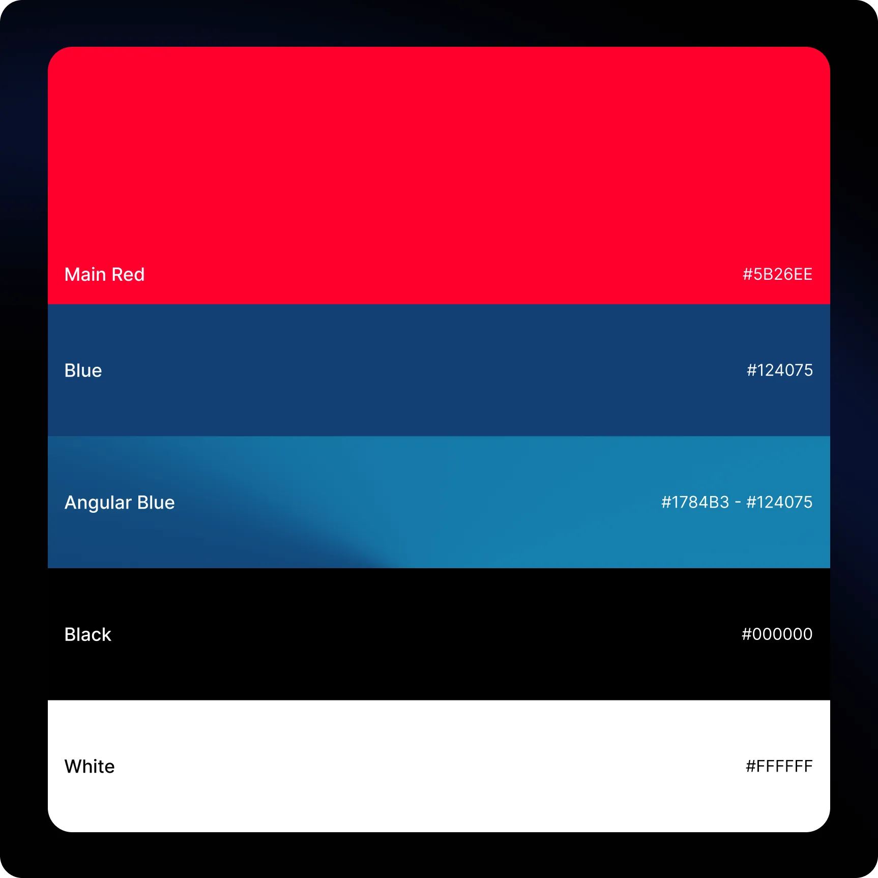
Revitalized Color System
We introduced richer reds and blues enhanced by deep gradients that bring energy, dimension, and clarity to the visual identity.
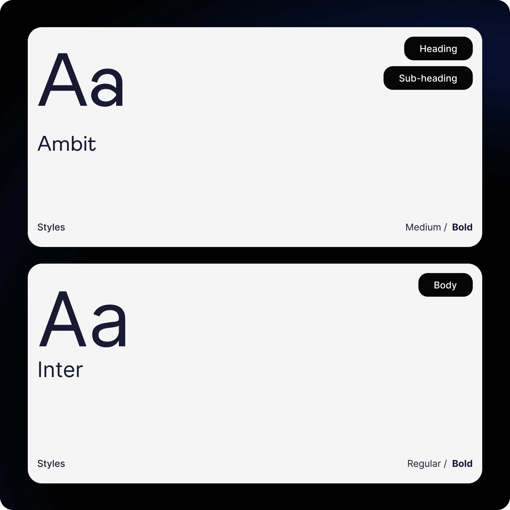
Dynamic & Readable Typography
A refined typographic system using Ambit and Inter created stronger hierarchy, improved legibility, and added a modern editorial rhythm.
Elevated Visual Framework
Through balanced color usage, refined components, and improved spacing, the new design brings cohesion, vitality, and functionality to the brand experience.
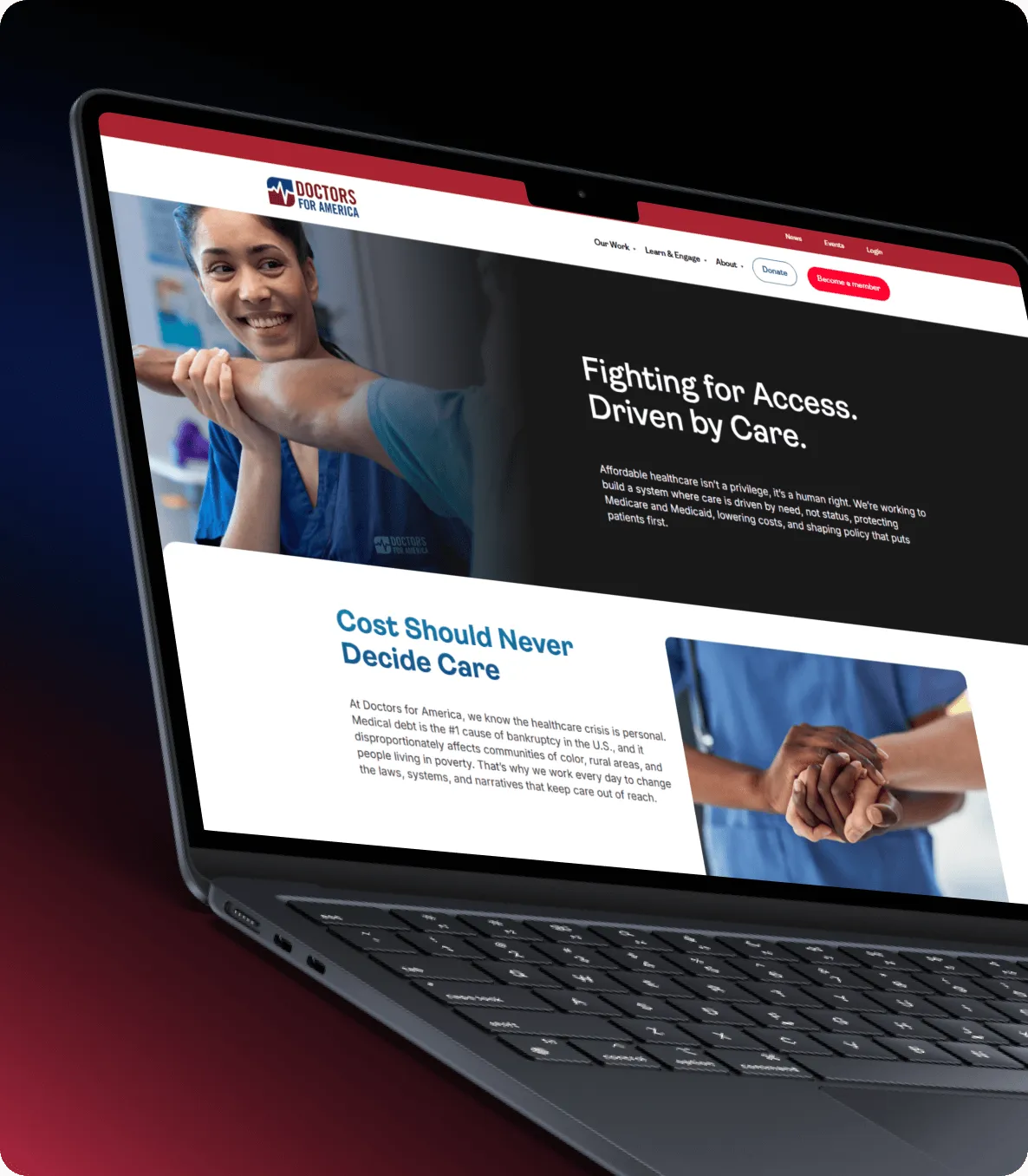
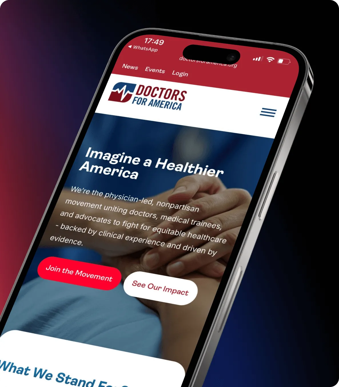
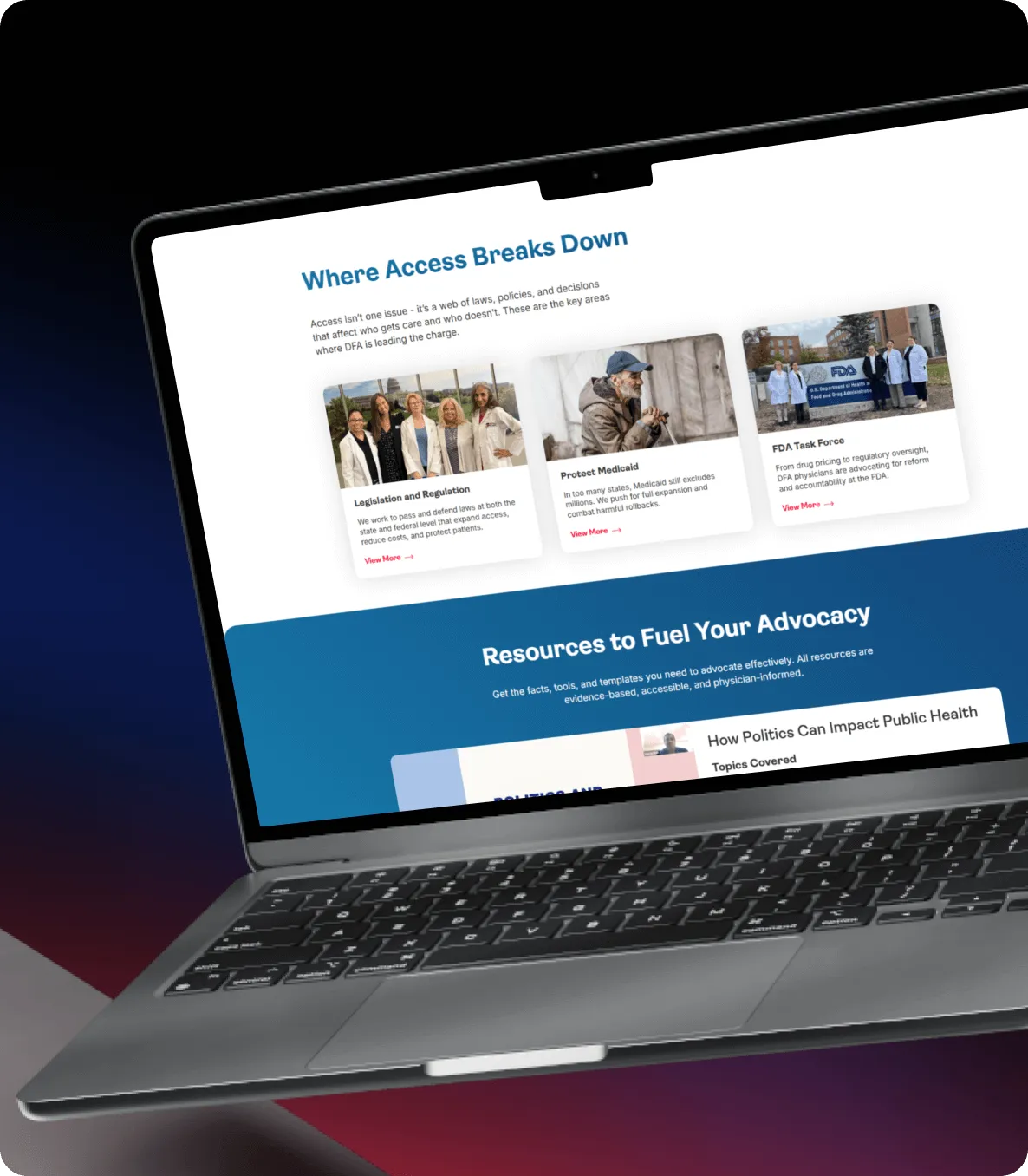
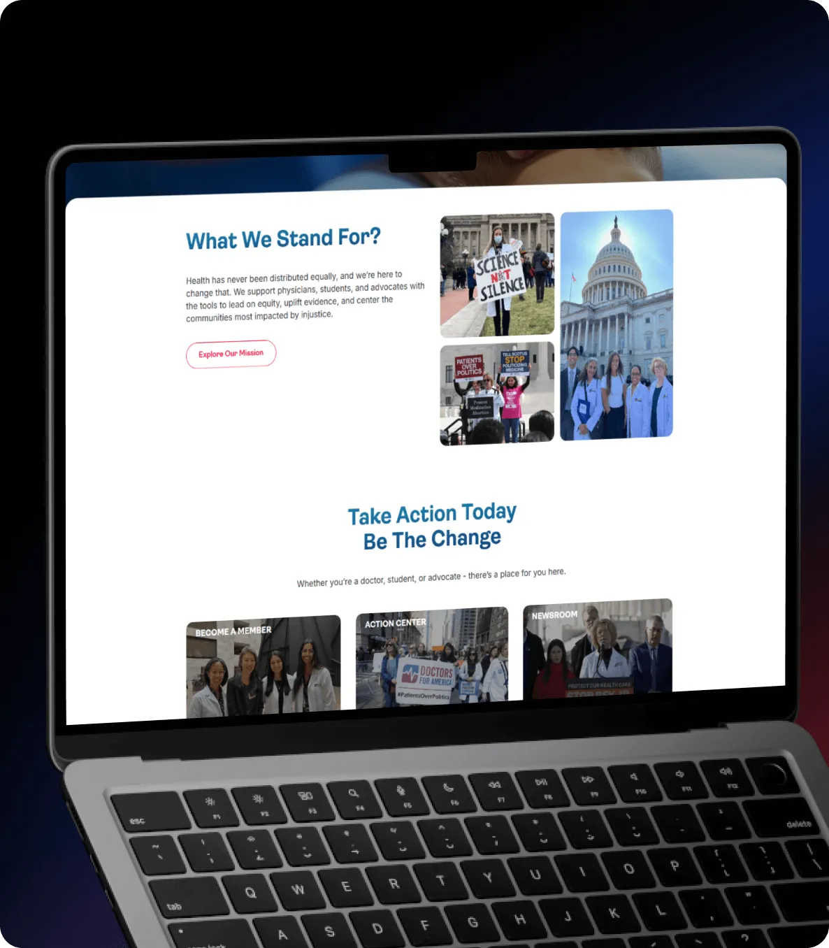
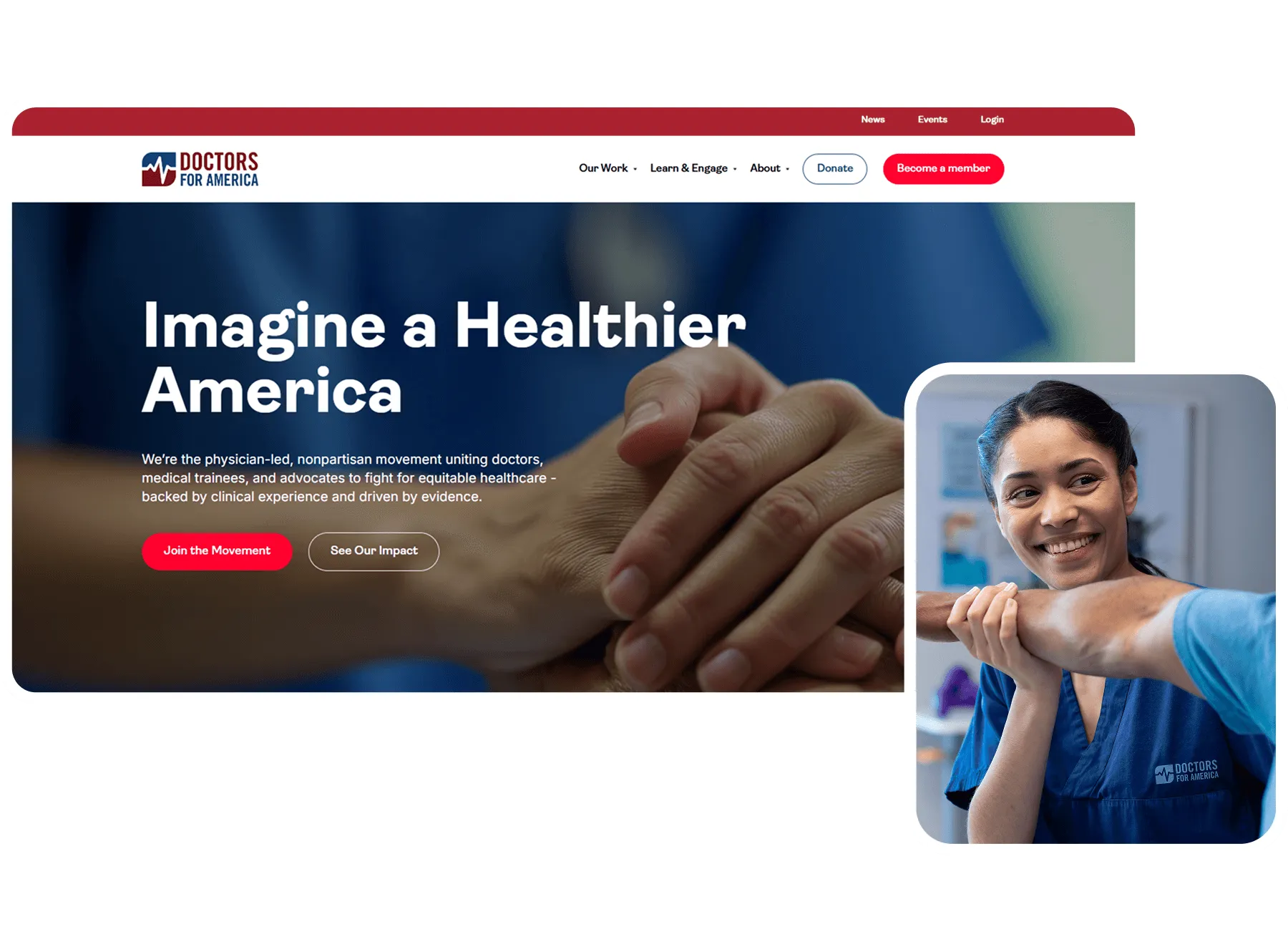
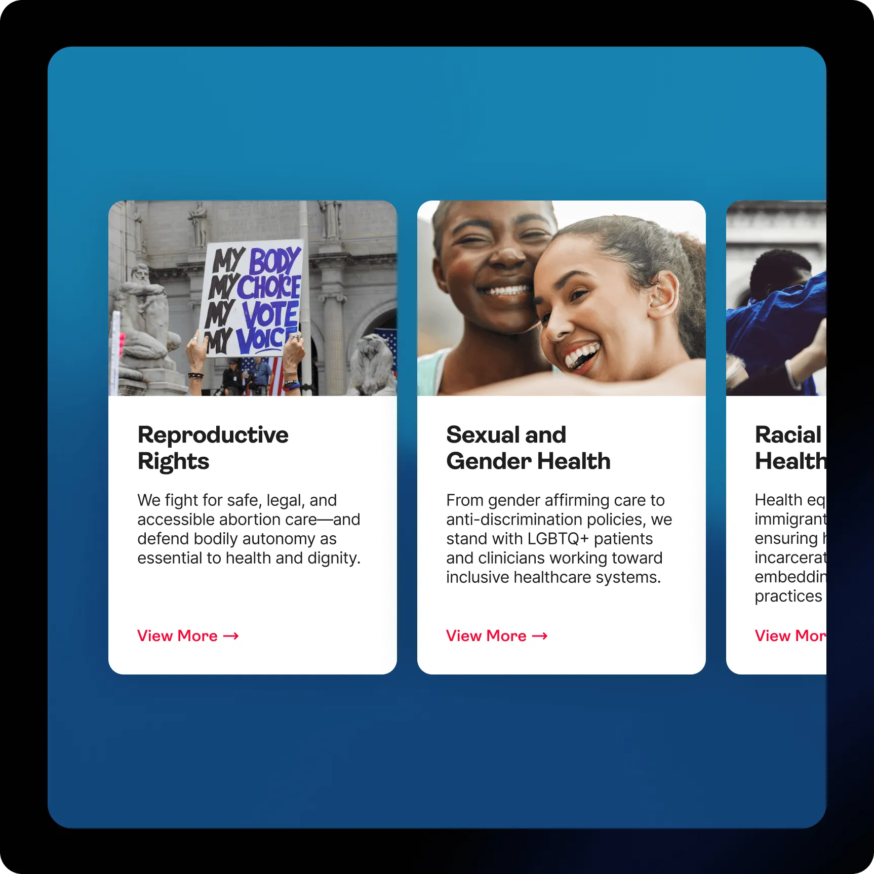
The DFA website was redesigned to reflect the strength and urgency of a national healthcare movement while maintaining clarity and accessibility for diverse audiences. The project began with research and structural planning to better organize the organization’s messaging, advocacy initiatives, and resources. From there, we developed a structured layout system designed to guide users naturally through the platform.

Through the introduction of a refined typographic system and a more expressive visual language, the DFA platform gained clarity, energy, and cohesion.
Color also plays a central role in the renewed identity. A vibrant palette built around red, blue, and the dynamic Angular Blue gradient adds depth and momentum to the interface, reinforcing both trust and urgency.


“I can’t thank the team at Charly enough for all of the hard work and long hours you put into the site. It looks amazing and I’m incredibly excited about what we built together.”