
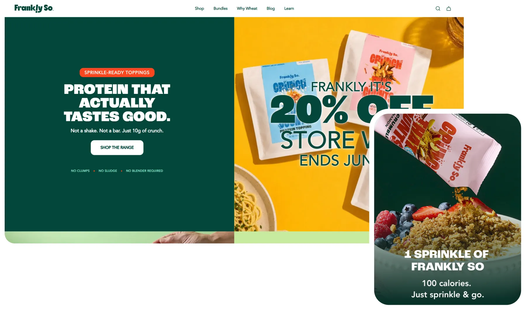
Frankly So
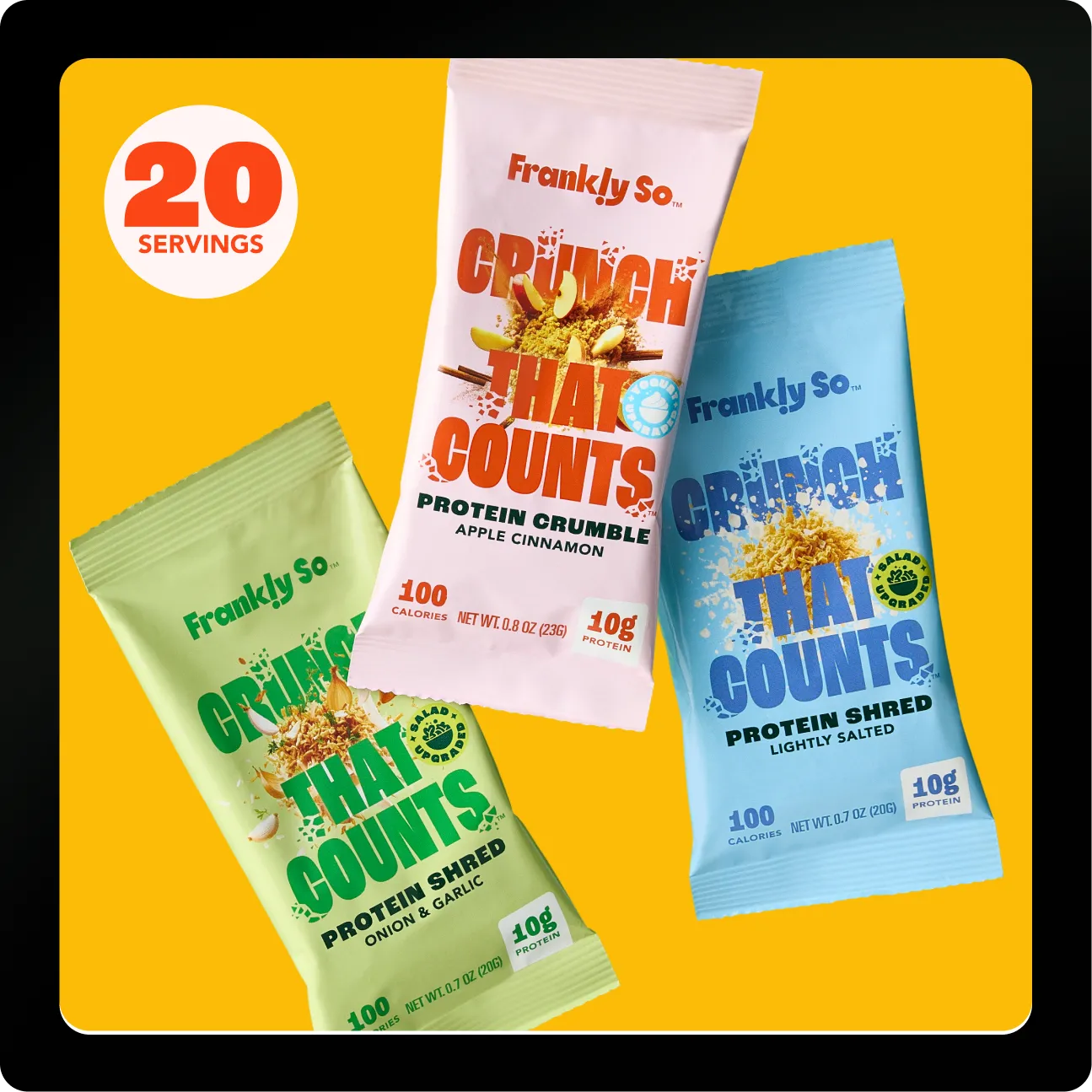
We partnered with Frankly So to rethink how protein is sold online, positioning their toppings as the effortless, real-food alternative to shakes and bars for people who want more protein without changing how they eat.
Frankly So had a genuinely different product, a crunchy topping you sprinkle onto food you already eat. But the old store sold it like any other supplement.
The positioning was buried under specs, the layout followed a default template, and a weak call to action gave shoppers no clear next step.
We rebuilt the experience around one simple promise: protein made effortless. A sharper value proposition, a benefit-led hierarchy, and a conversion-focused structure now carry visitors from curiosity to cart. The outcome is a distinct, appetite-driven brand and a store built to turn interest into orders.
Process
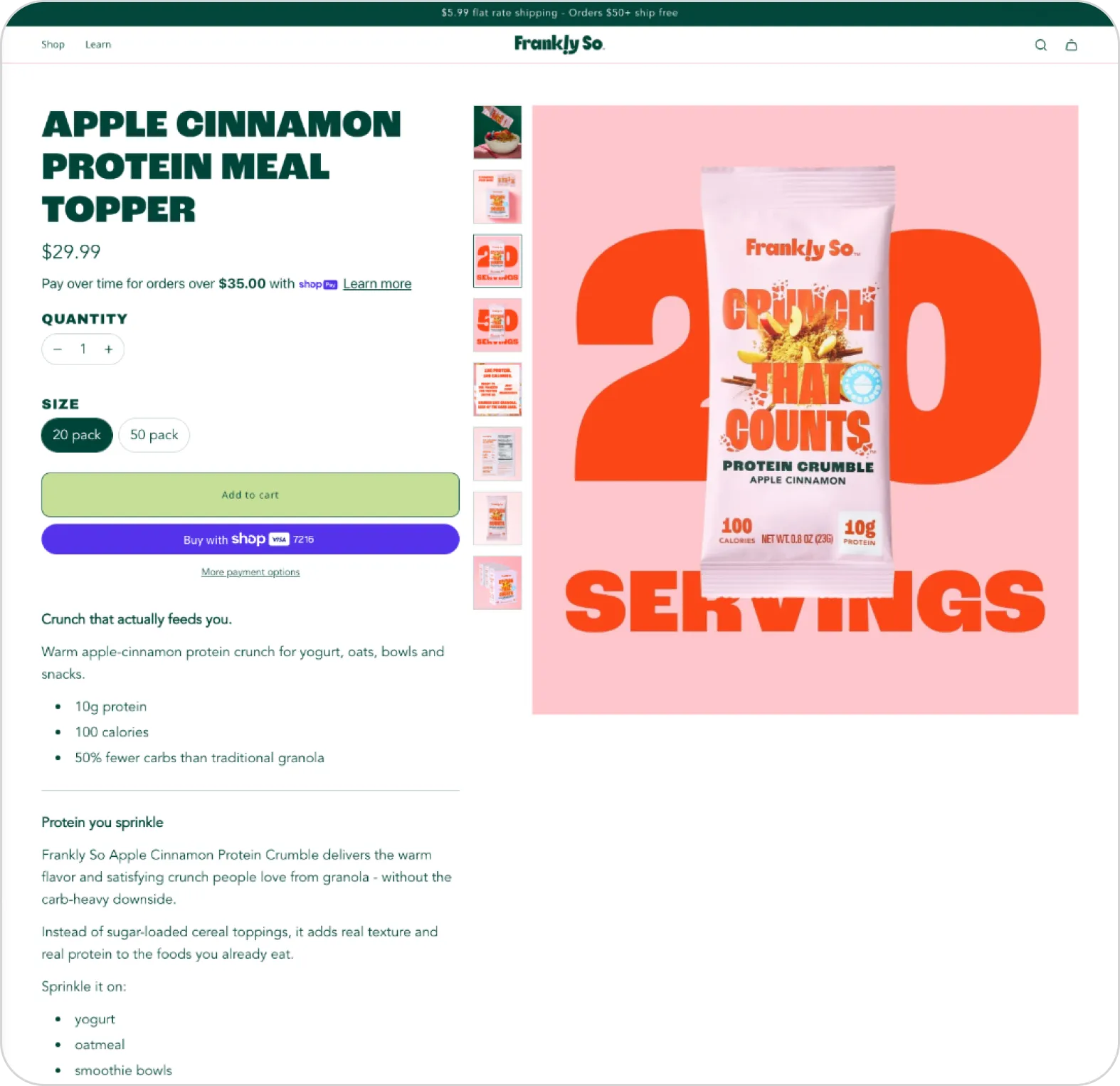
Positioning Buried Under Specs
The old page led with price and product specs before purpose. Shoppers had to read a wall of text to understand why a topping beats a shake or a bar, which raised cognitive load and lost them early.
Generic Template, Weak CTA
A near-default Shopify theme gave the brand no real identity, and a low-contrast add-to-cart button blended into the page. Nothing guided the eye to the primary action, so the product read as a commodity.
Specs Without Proof
Benefits were listed as flat bullets with no comparison, no expert validation, and social proof pushed to the bottom. Nothing turned "10g of protein" into a reason to buy or eased purchase doubt.
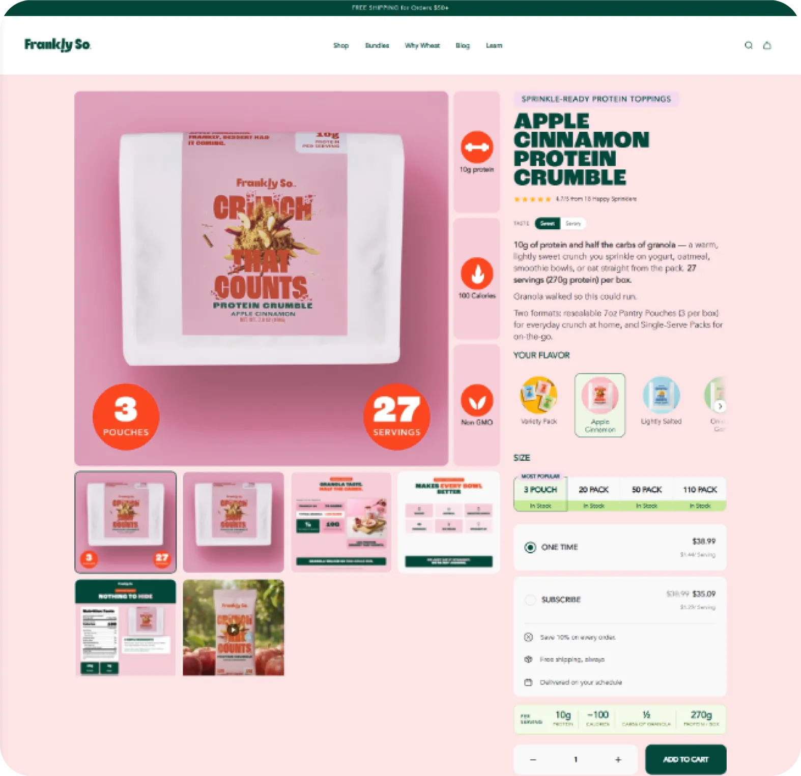
Sharp Category Positioning
Every page now opens with a benefit-first promise: real protein you sprinkle on, not another shake or bar. The value proposition and target user land in the first few seconds, cutting cognitive load and holding attention.
Conversion-First Structure
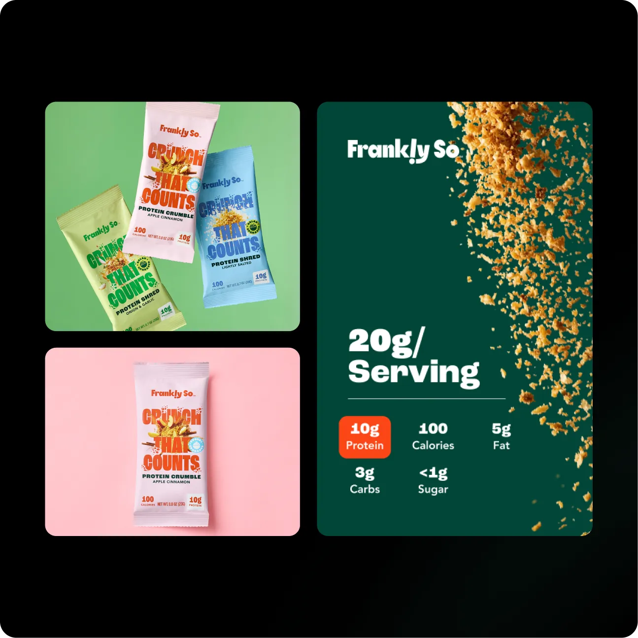
The layout is rebuilt around the buy decision. A scannable spec grid, visible savings, a subscribe-or-buy-once toggle, stock cues, and a high-contrast CTA with a sticky buy bar make the path to purchase obvious on every scroll.
Proof That Removes Doubt
A category comparison table, a three-step how-it-works, a dietitian endorsement, authentic reviews, and a 30-day guarantee answer every objection in-page, building trust exactly where hesitation happens.
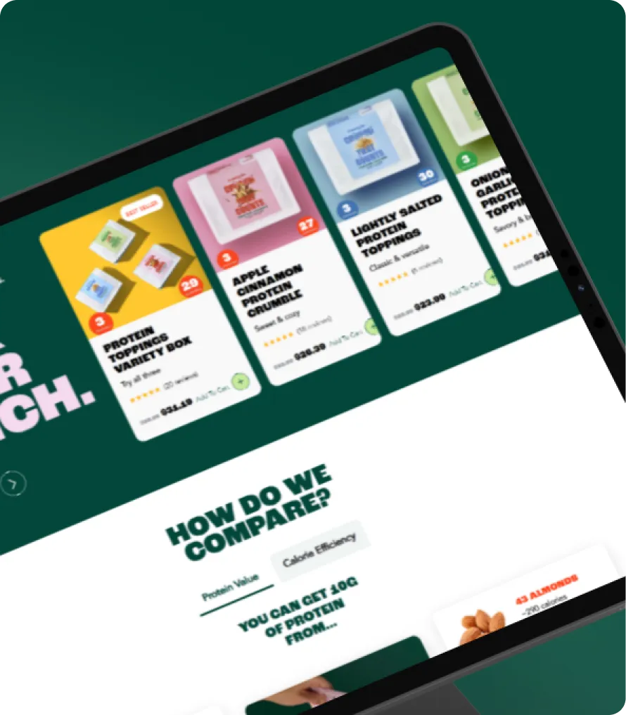
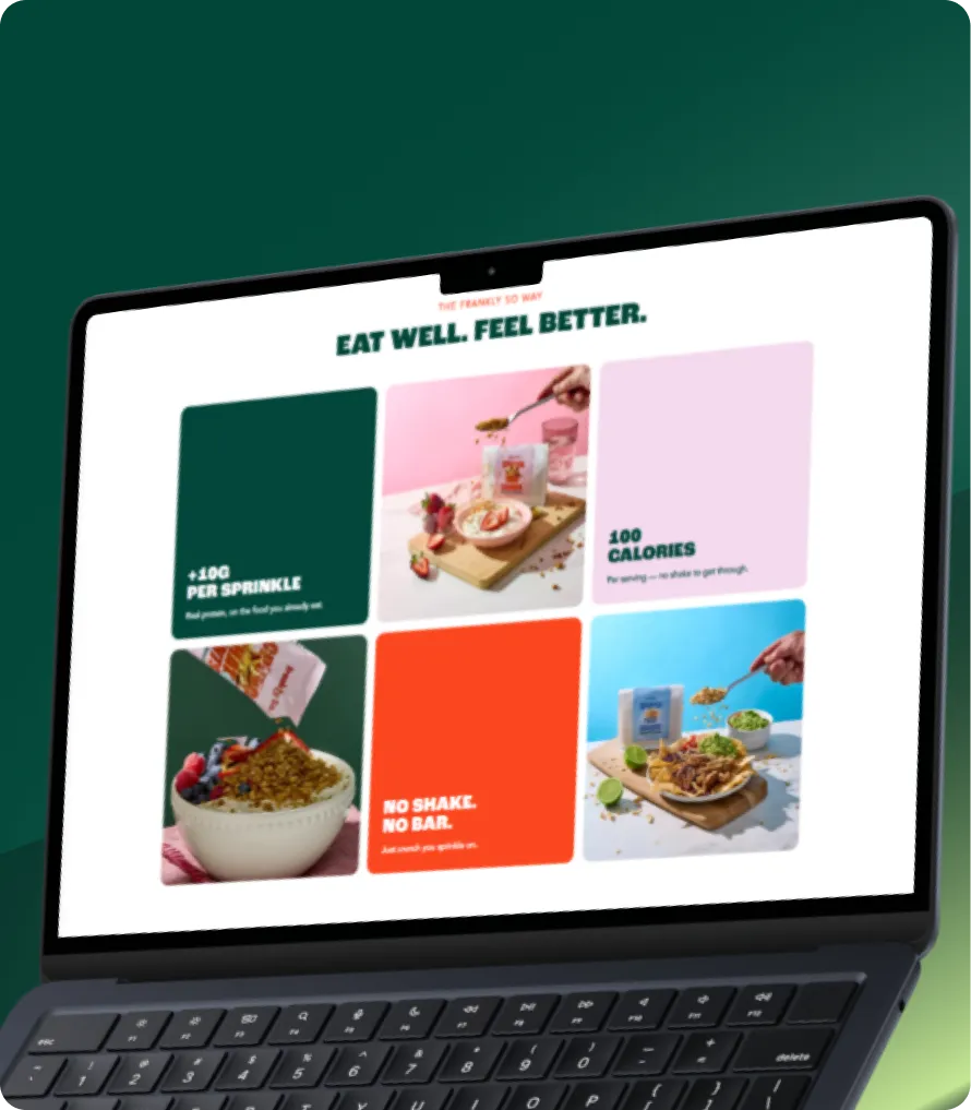
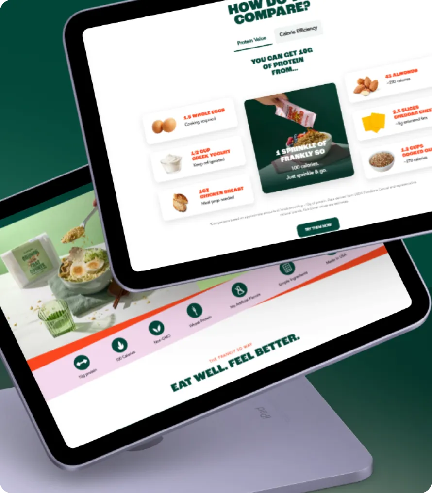
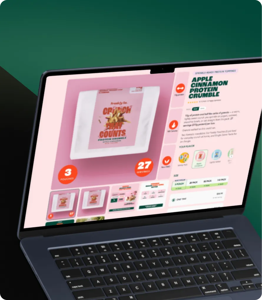
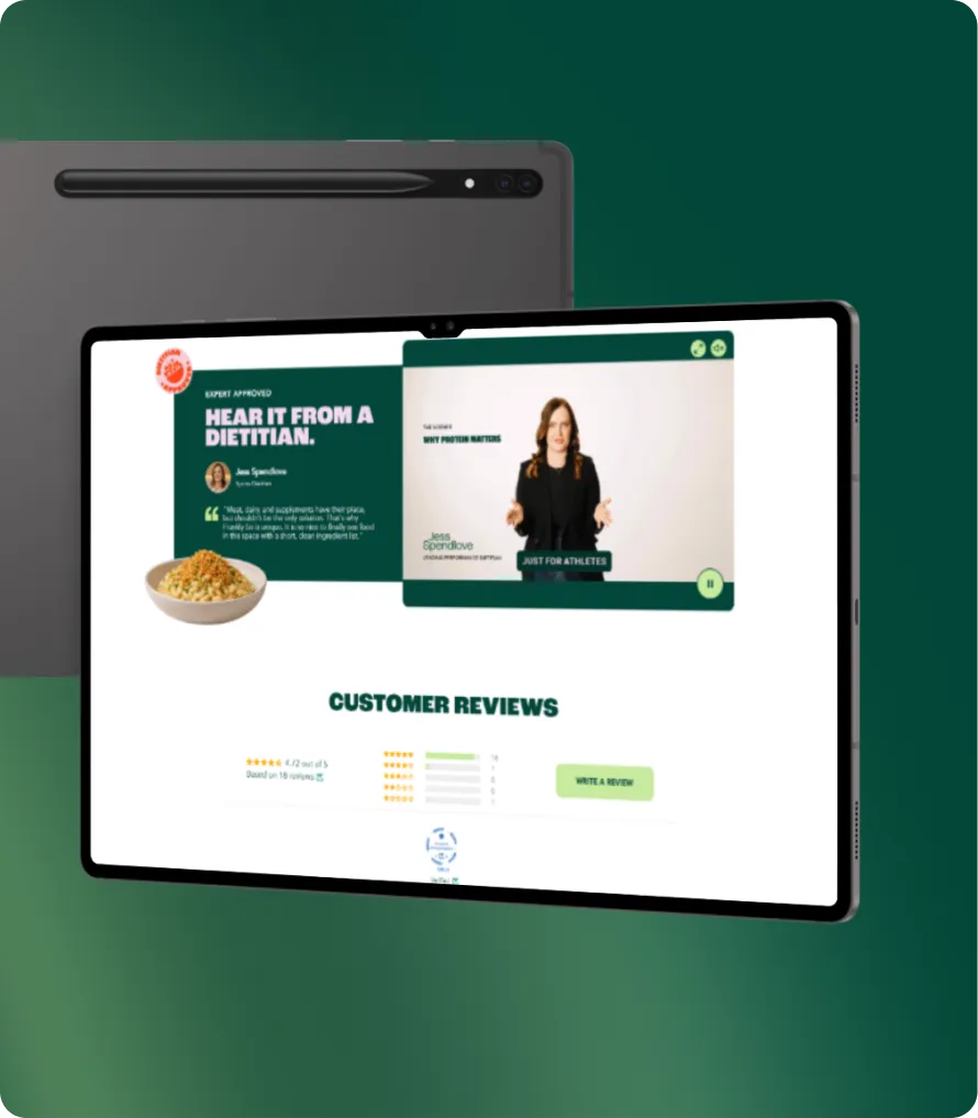
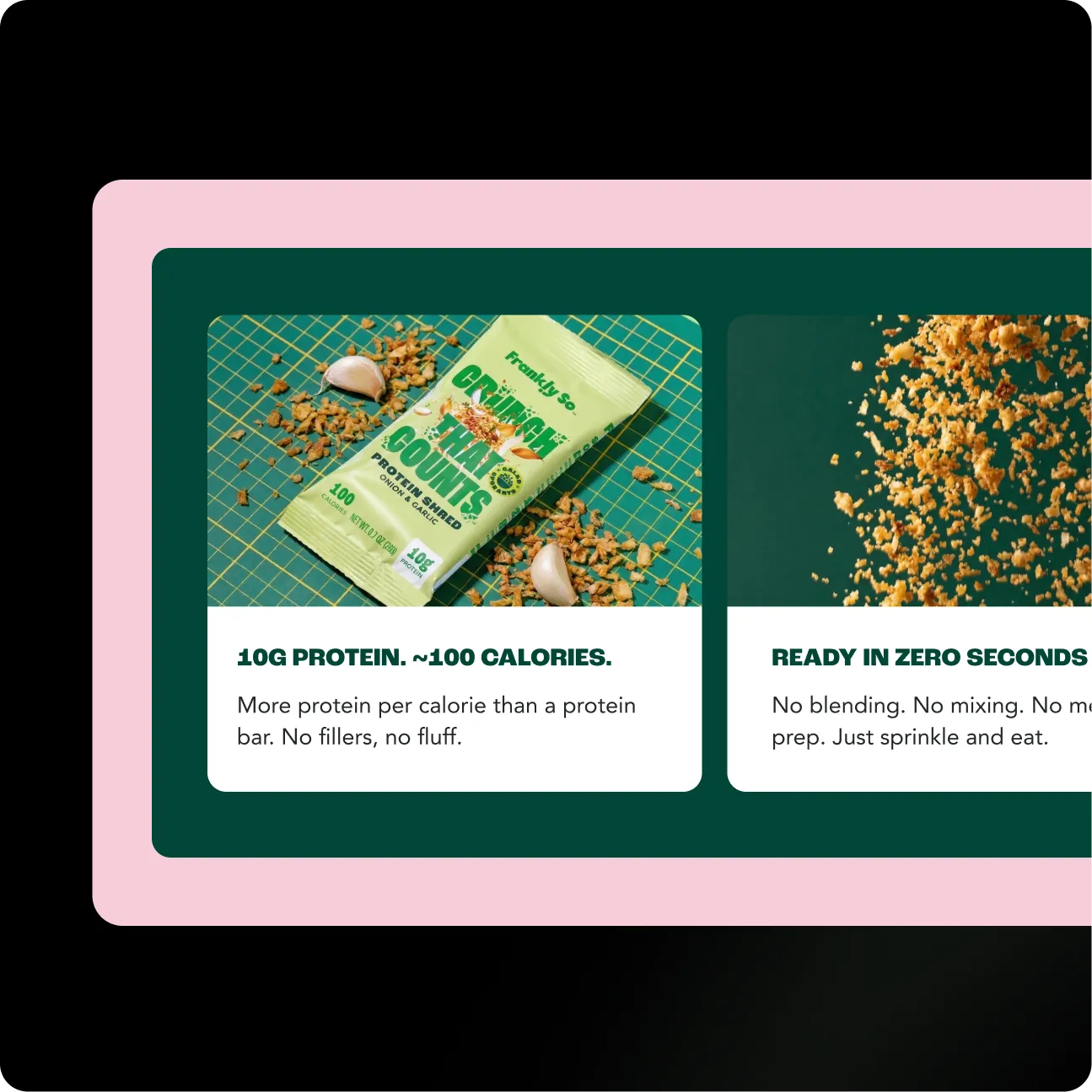
The Frankly So store was rebuilt around a single, effortless idea. Instead of listing specs, the new structure takes shoppers from a familiar frustration, protein that feels like a chore, to a solution they can sprinkle on in seconds. Every section was designed to build trust, prove real value, and move people confidently toward their first order.
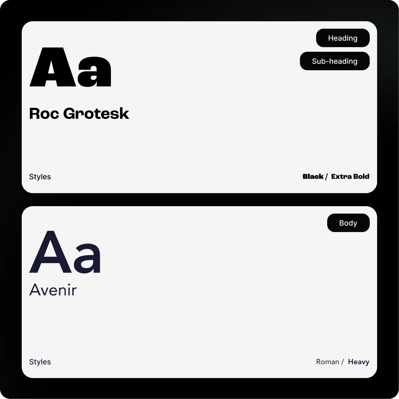
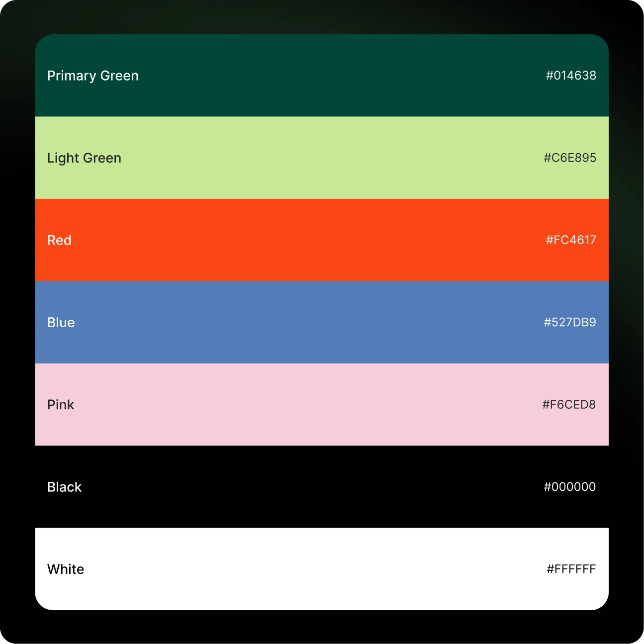
A bold, confident type system anchors the brand. Oversized display headlines create appetite and impact, while a clean, readable sans keeps benefits and nutrition scannable at a glance.

"Charly understood what made our product different better than we did. They turned a generic store into a brand that finally sells the way our product deserves, and the change in how people respond speaks for itself."