
.webp)
Front Pack
We partnered with Front Pack to build a sports media platform that reads like an athlete wrote it and sells like a media company built it, covering health, wellness, fitness and endurance in one athlete-first hub.
Front Pack entered a category dominated by business-first outlets that cover the industry from the outside.
The brand needed a digital home that carried the credibility of a newsroom without the corporate coldness that comes with it.
Our objective was to build an editorial platform that earns reader trust on the first scroll, makes content genuinely easy to discover, and gives brands a clear, professional path to advertise, submit news and request reviews.
Process
.webp)
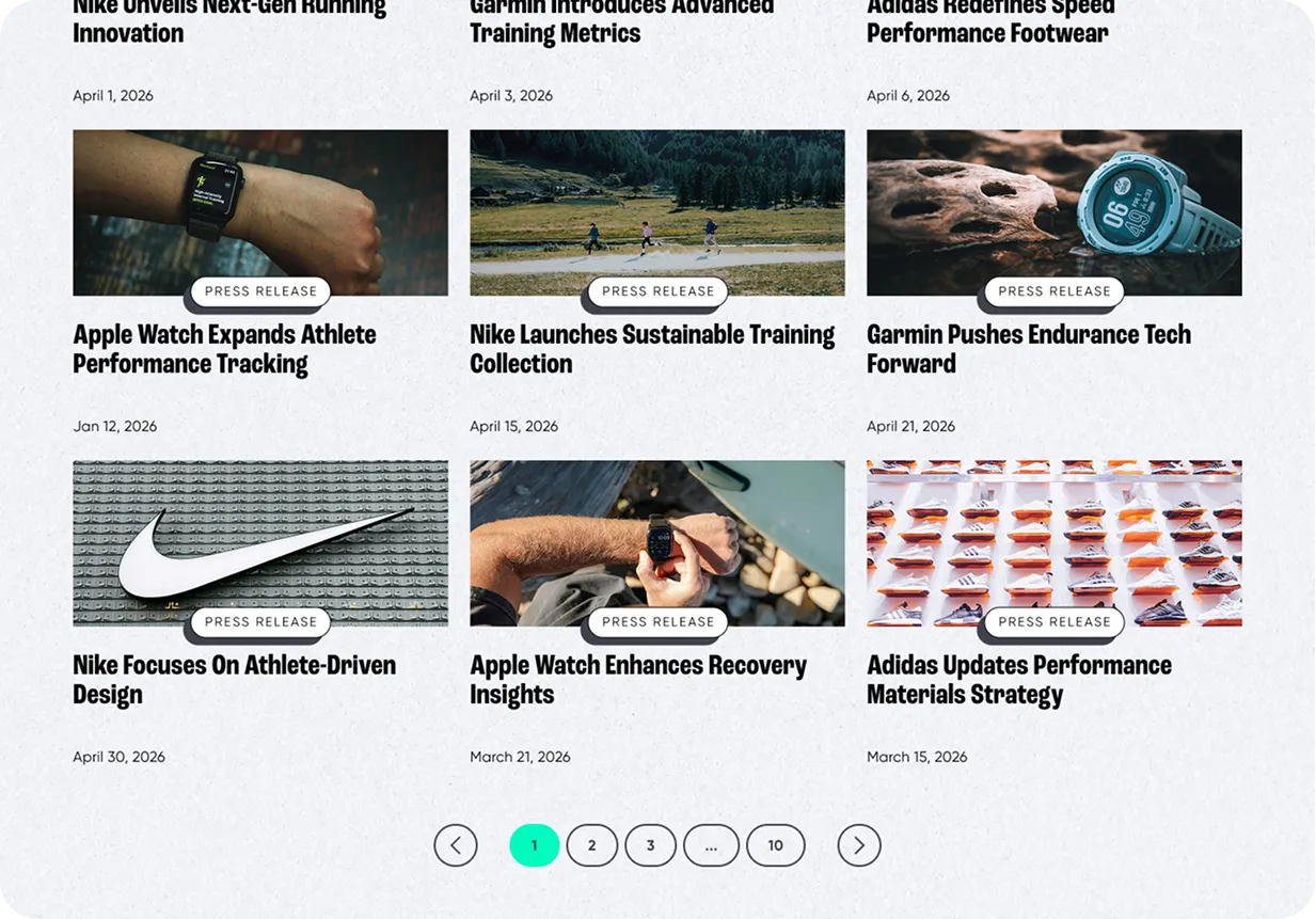
Athlete-First Editorial Structure
We built the homepage as a layered newsroom rather than an endless feed. A dominant headline module carries the lead story, followed by category-labeled article grids that let readers scan by interest in seconds. Every card surfaces its coverage type before the reader commits, which reduces decision friction and increases the chance of a second and third article per session.
A Dual Audience, Two Clear Paths
Front Pack serves readers and brands at the same time, so the layout gives each one an unmistakable route. Editorial modules dominate the reading flow, while dedicated partner sections and a three-way action block route brands toward news submissions, gear reviews and advertising without ever interrupting the editorial experience.
Growth Built Into the Layout
Newsletter capture is placed at the top of the page, mid-scroll and at the close, each with a different reason to subscribe rather than a repeated form. Trusted brand logos and social proof sit directly beneath the partner call to action, so commercial intent is always backed by credibility at the moment it matters.
High-Contrast System with Purposeful Motion
A dark foundation carries the editorial sections and gives imagery maximum impact, then breaks into a lighter section for gear and reviews to create rhythm and separate content types. Subtle scroll-based motion and a centered brand mark add energy without slowing the read.
.webp)
.webp)
.webp)
.webp)
.webp)
The Front Pack platform was designed around a single promise: everything an athlete needs to understand the industry, in one place, told by people who actually train and race. Instead of a flat news archive, the site is structured as a series of distinct content worlds, news, gear, announcements and partnerships, each with its own visual weight and entry point. The result is a platform that feels like a premium media brand on the first screen and still keeps readers moving deeper into the content on every scroll.
.webp)
.webp)
.webp)
.webp)
Color Palette
The palette leans on a deep, near-neutral base that lets photography and headlines carry the energy, lifted by one saturated accent reserved almost entirely for actions. Because that accent never appears decoratively, every subscribe, read and partner prompt reads as a clear next step rather than another element on the page.
Typography
A bold, condensed display face gives headlines the volume of a sports brand and keeps long titles compact inside dense grids. Beneath it, a clean and highly legible text face handles article copy, labels and metadata, so scannability holds up even on the most content-heavy sections.
Closing (visual system → conversion)
The visual system was built for scale, not just for launch. Reusable card modules, consistent category labeling and shared templates across news, reviews and announcements mean the team can publish daily without design decay, and the CMS architecture lets Front Pack grow content volume without developer support.
Conversion mechanics were designed into the structure rather than added on top. Newsletter capture, partner inquiry and content submission each have a dedicated moment in the scroll, supported by proof and framed in the brand's direct, no-nonsense voice. The outcome is a platform that grows an audience and monetizes it from the same page.
.webp)
.webp)
.webp)
.webp)
.webp)
"They showed a ton of interest in the space we live in, which set them apart from other agencies we spoke with. Rather than applying a templated approach, they took the time to learn about our niche, our customers, and our goals. That genuine curiosity translated into a website that feels authentic to our brand and resonates with our audience."