
InSynergy Labs

Case Study
From Confusing and Clinical to Clear, Aspirational, and Conversion-Ready
Overview
Insynergy Labs is a high-performance supplement brand offering clean, scientifically backed formulations. They reached out to our Agency due to their premium product quality not being reflected by the original landing page.
What was going wrong
- Weak conversion paths. Vague headlines, buried CTAs, and scattered hierarchy reduced movement to product pages and checkout.
- Slow loading. A low-resolution lab video, a distractor pill animation, and uncompressed images can harm mobile performance.
- Value props buried. Ingredient quality, potency, and scientific validation were difficult to find or inconsistently presented.
- A sterile visual style and stiff layouts undermined premium positioning.
- Mobile friction. A noisy top navigation and small tap targets discouraged deeper browsing.
- Poor category discovery. “Product lines” did not match how shoppers think.
- Underused trust. Text-only testimonials and generic quality bars did little to reassure new visitors.
Taking all these issue into account, we redesigned the landing page into a visually attractive and mobile-optimized experience. The new design creates emotional relevance, guides users more effectively, and makes the purchasing process easier by better showcasing relevant information.
Visit Page

Before
After
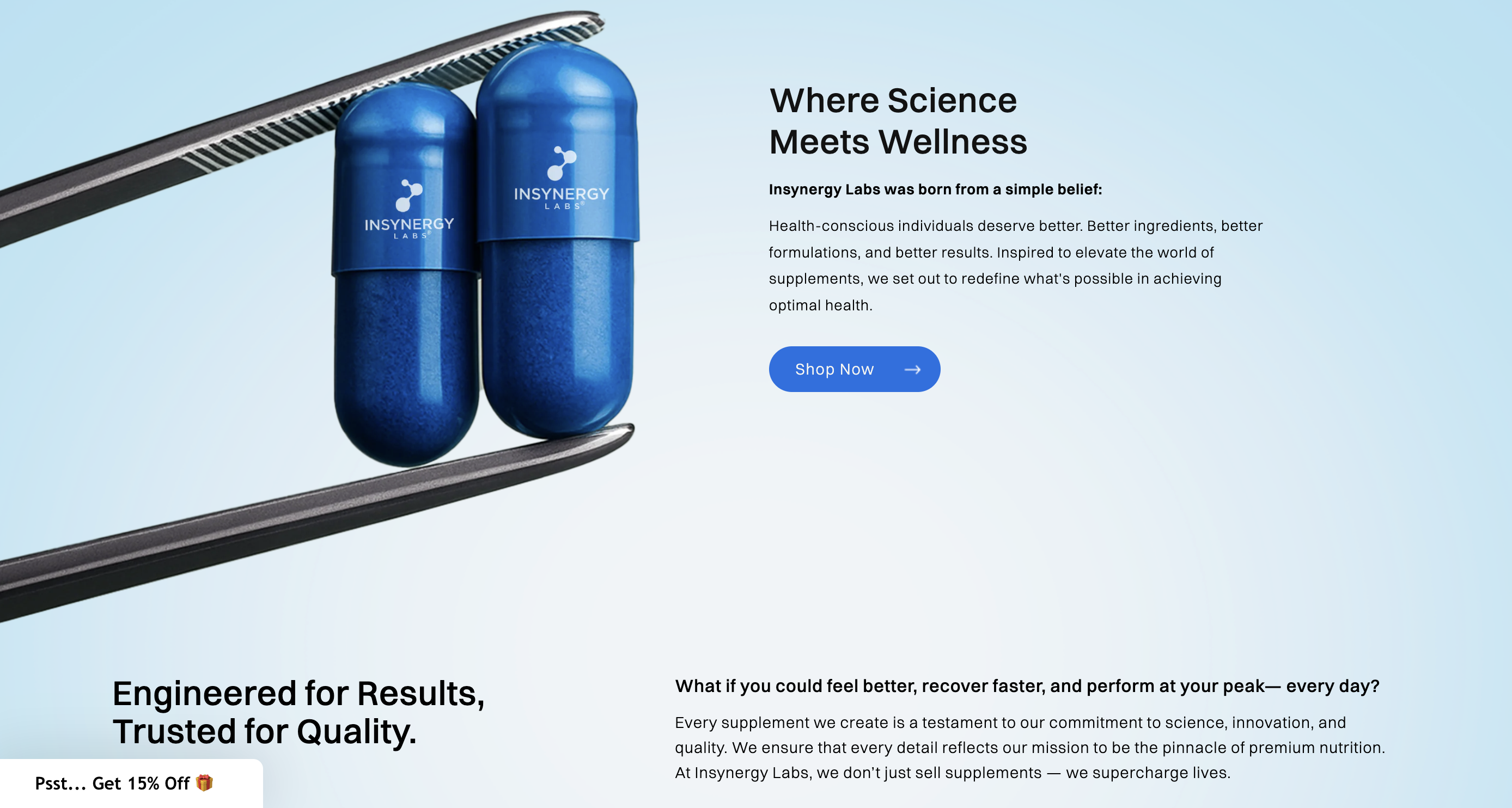
Hero Section: Aspirational and Focused
The old hero featured a disorienting pill animation and a low-resolution video of a lab, paired with disconnected messaging. The copy was vague, and the visual structure lacked balance.
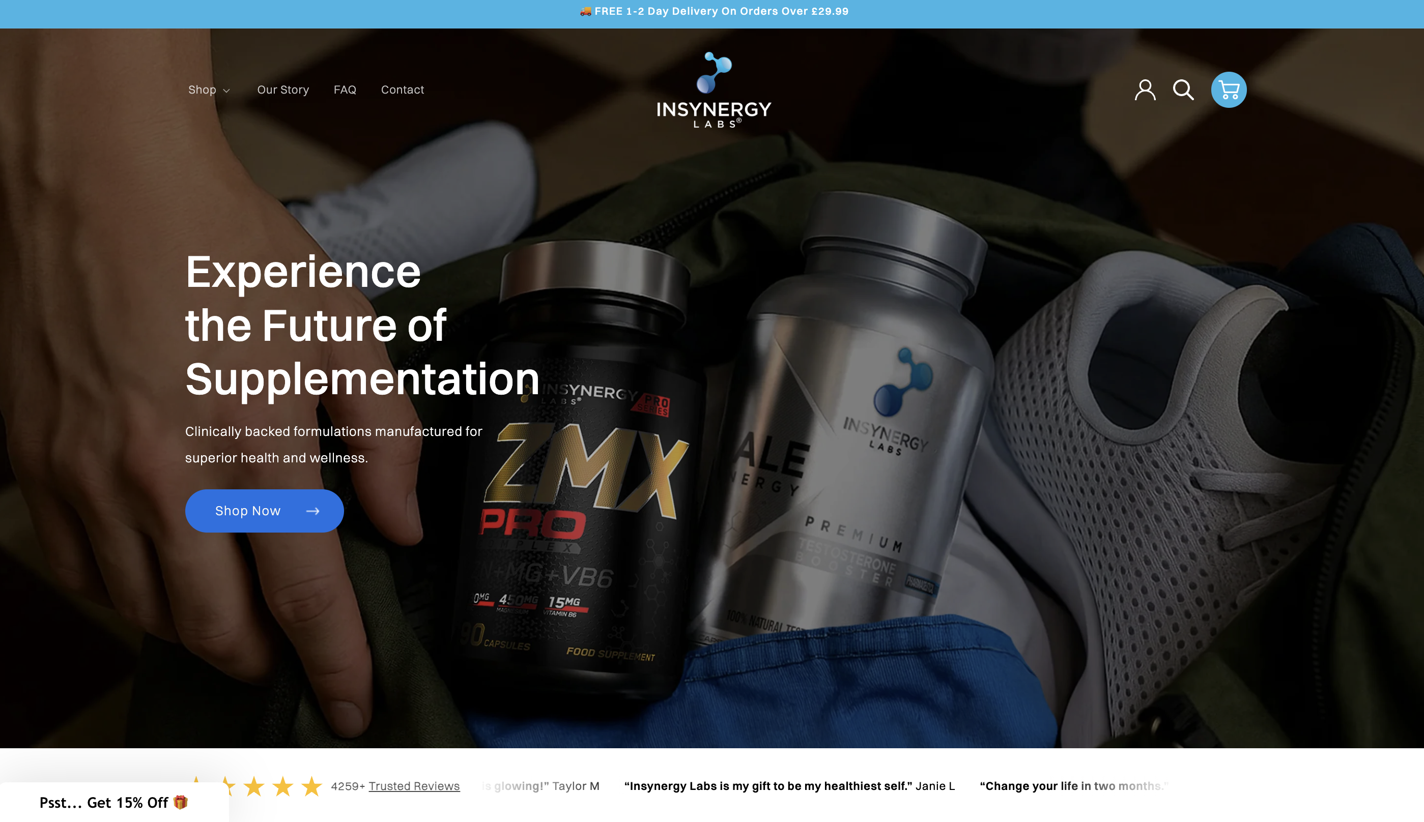
The new hero introduces a high-quality photo of someone pulling a supplement out of a gym bag, conveying an aspirational and health-focused lifestyle. The headline reads “Experience the Future of Supplementation” followed by a short description and a prominent “Shop Now” button. On the top of the site, an shipping announcement bar at the top, with a light blue strip displaying a discount on delivery of the supplements. This addition helps entice buyers by emphasizing a key purchase incentive right away.
After the improvements layout is clean, visually engaging, and optimized for consumer retention.
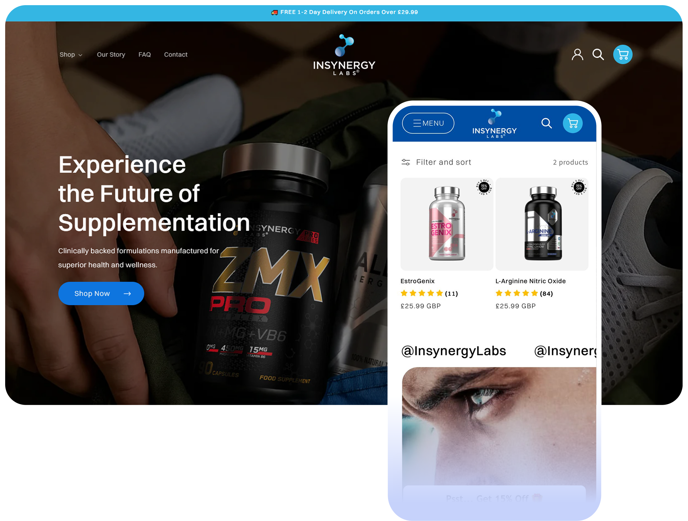
Navigation: Clean and User-Friendly
Previously, the site used a standard top navigation bar that contributed to visual noise.
We replaced this with a simplified hamburger menu. When clicked, it reveals all key links and subcategories in an organized layout. This approach enhances mobile usability and keeps the interface clean and distraction-free.
Bestsellers: Optimized for Engagement
The old bestseller section was one of the best sections in the original landing page, so instead of radically changing it, we focused on improving the aesthetic feel of this part of the wireframe.

In the new version, top-selling products are displayed in a horizontal carousel. Each card includes a product image, star rating, price, and a hover-effect “Add to Cart” button in a consistent blue. Navigation arrows allow users to scroll through more options.
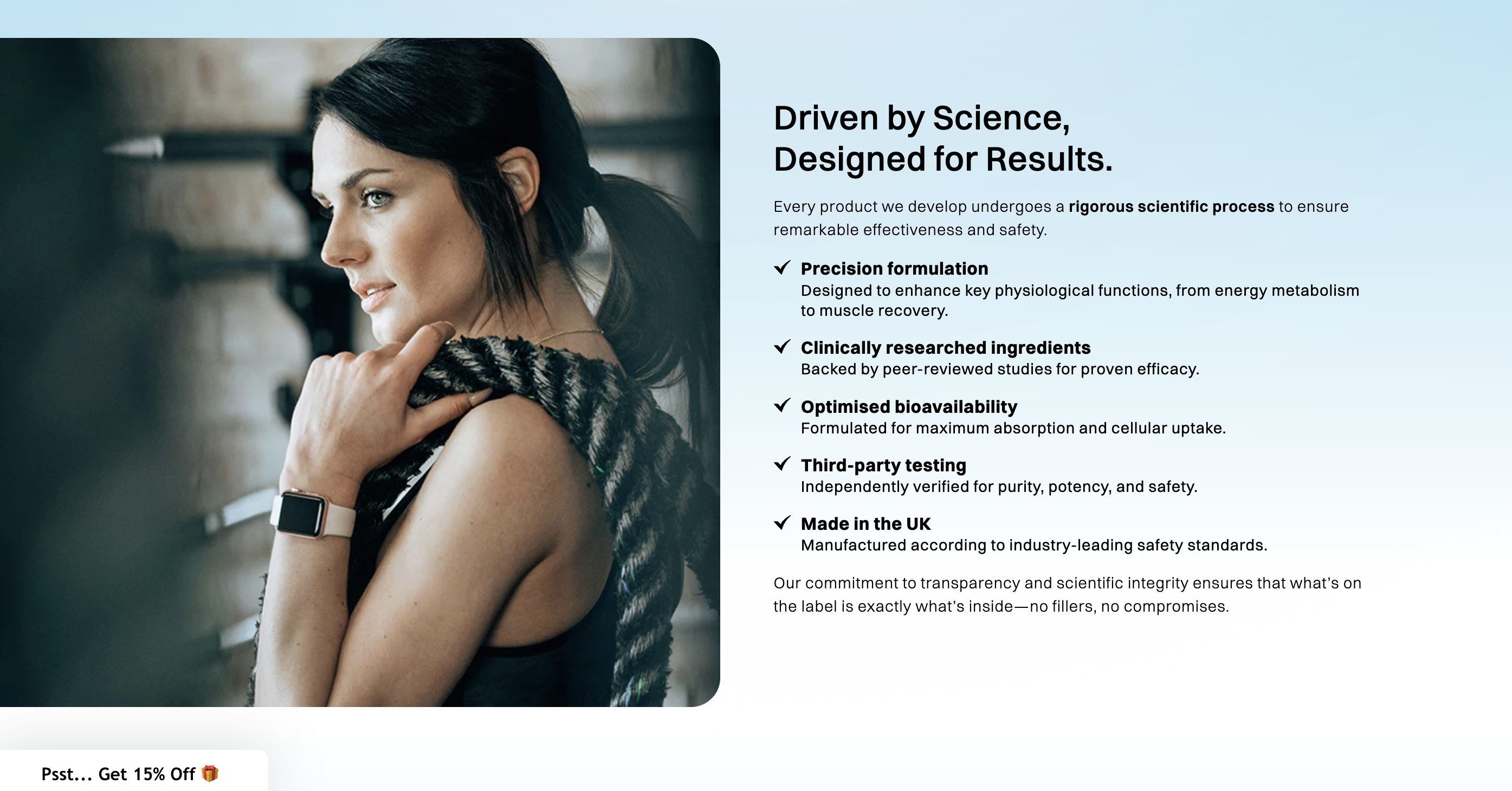
Product Benefits: Balanced and Visual
Previously, product benefits were presented through long text blocks and lacked visual support.
The updated section features a left-aligned column with three key attributes—exceptional quality, unmatched potency, and scientifically backed formulations—each with a short description and custom icon. On the right side, photos of athletic individuals reinforce the brand’s lifestyle appeal. The result is a clear, benefit-focused section that tells the story visually and persuasively.

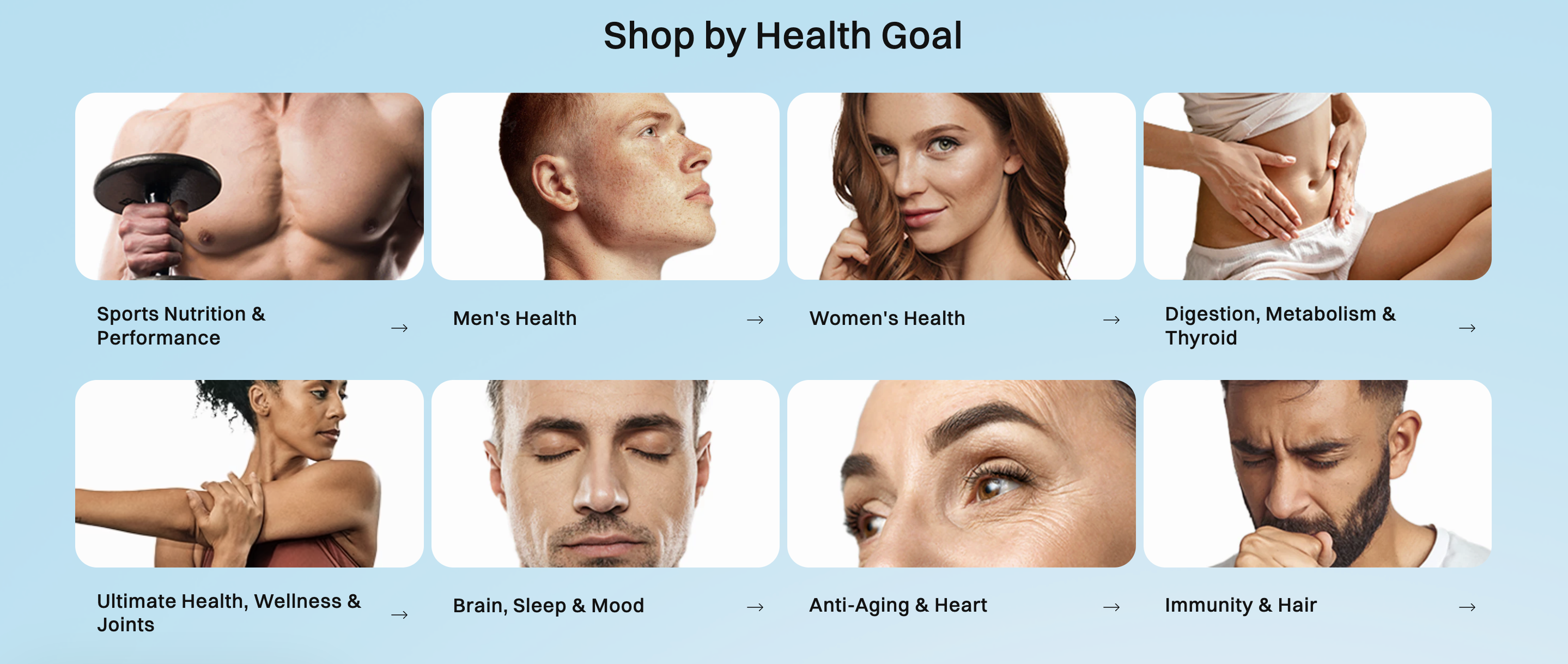
Shop by Health Goal: Personalized Discovery
The older layout buried product categories under vague “product lines.”
We introduced a clear “Shop by Health Goal” section that lets users browse based on needs like Sports and Bodybuilding, Men’s Health, Women’s Health, Digestion, Sleep and Brain, Anti-Aging, and Immunity. Each goal is supported by an image and a direct navigation button. This helps users self-select what matters to them and jump directly into relevant collections.
Ingredients and Quality Standards: Clearly Communicated
Before, the page presented quality claims with a generic bar graphic and flat copy.
The redesigned section highlights key standards—Vegan, Non-GMO, Gluten-Free, and Money-Back Guarantee—each paired with its own icon. A side image shows the physical supplement pills, adding visual reference and context. This creates a quick and trustworthy overview of what sets Insynergy apart.

Testimonials: Human-Centered and Credible
The original testimonial section was text-only and lacked an emotional connection.
We introduced a layout with real customer photos, names, product ratings, and quotes. A rotating carousel allows users to scroll through multiple stories. The section opens with the title “Redefining Wellness with Every Capsule” and includes an overview of general customer reviews beneath. This makes the feedback feel authentic and relatable.

Call to Action: Clear and Motivational
A new CTA section was added to re-engage users after they explore product information, close to the Homepage's footer. It features the line “The power to change your health starts now,” followed by a strong supporting message and a large blue “Shop Now” button. This section encourages action and drives users into the checkout funnel.

FAQs and Footer: Informative and Structured
FAQs are now collapsible, allowing users to click a plus icon to expand answers. This interaction keeps the page tidy and easy to navigate. A subtle visual loop of supplement images anchors the section and maintains visual interest.

The footer was also improved with clear link groupings, updated contact info, social media icons, and a well-labeled newsletter subscription field. Visually, it draws the user attention with an animation.

About Page: A New Chapter of the Brand
The About page was created from the ground up to give the brand a human and credible voice. Instead of recounting company history, it tells a story about purpose, science, and quality.
Sections such as What Sets Us Apart, Driven by Science, and Our Uncompromising Quality communicate the brand’s values with confidence. The writing is direct and grounded in facts, supported by GMP and ISO certifications, third-party testing, and ingredient traceability. Clean typography and imagery make the content easy to follow, while subtle calls to action invite readers to continue exploring the shop.
This page now acts as the trust anchor of the brand, where storytelling and substance come together to create credibility.
Product Pages: Clarity, Structure, and Persuasion
The previous product pages were text-heavy and lacked visual hierarchy. The new version is structured, modern, and designed to convert while maintaining a calm and premium look.

A Clear First Impression
Above the fold, users immediately see the product image, title, price, and purchase options. The “Add to Cart” button stands out, and trust badges like “Vegan” and “Non-GMO” provide instant reassurance.
Dual-Purpose Design
Quick buyers can purchase directly, while more detailed readers can expand collapsible sections for Benefits, Ingredients, Usage, and FAQs. This structure supports both browsing styles without cluttering the layout.
Benefit-First Messaging
Every section begins with results-oriented statements such as “Supports Energy and Focus” or “Enhances Cognitive Function.” Icons and photography help users absorb information quickly.

Social Proof and Reviews
Customer reviews now feature real names, verified ratings, and photos. This placement turns feedback into a conversion driver and builds credibility.
Consistency and Scalability
A modular template ensures uniformity across all products, allowing future items to be added seamlessly while maintaining the same polished design.
Conclusion: A Transformation That Reflects the Product’s Value
The new InSynergy Labs website represents a complete transformation in how the brand is perceived. What once felt cold and fragmented now feels confident, aspirational, and conversion-driven.
The redesign unites science with storytelling, trust with emotion, and clarity with performance. Visitors can now navigate effortlessly, connect with the brand’s purpose, and make informed purchases with confidence.
This project was about more than visual improvement. It was about alignment between product quality and digital experience.
If your brand is ready to achieve that same alignment, we’d love to help you make it happen.
Get in touch with Charly Agency.
