

JPG
Our design agency was commissioned for the redesign of the JPG website, an innovative platform specializing in financial management.
JPG needed a modern, trustworthy digital presence that clearly communicated its mission: helping business owners take control of their finances and scale confidently.
We developed a strategic brand identity and a high-converting website experience focused on clarity, performance, and authority.
From brand strategy and visual identity to full website design and development, we crafted a cohesive system that positions JPG as a data-driven financial partner.The result is a confident, conversion-focused platform that speaks directly to ambitious entrepreneurs across the U.S.
Process
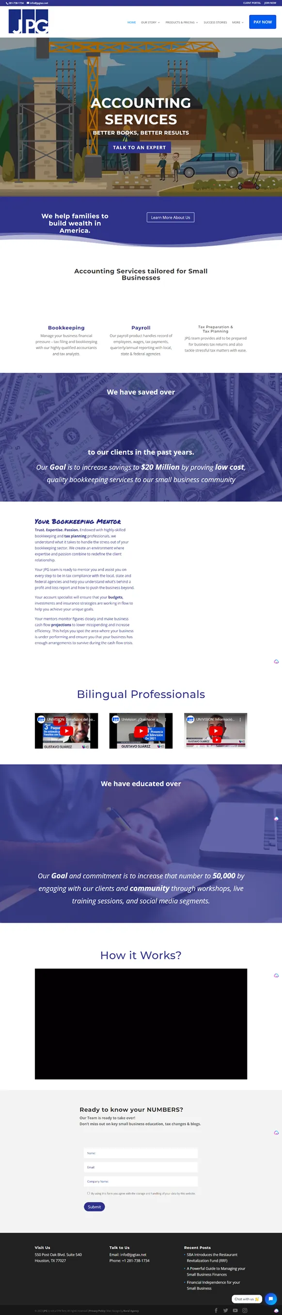
An Outdated Digital Presence
JPG’s previous website lacked clarity, visual impact, and strategic messaging. The brand didn’t fully reflect the authority and professionalism of the firm.
Unclear Value Proposition
Visitors struggled to quickly understand what JPG offered and how it differentiated itself in a competitive financial services market.
Limited Conversion Strategy
The site lacked strong calls-to-action and a structured user journey, reducing its effectiveness in converting visitors into clients.

A Bold Financial Identity
JWe introduced a modern, confident brand system that communicates trust, expertise, and clarity from the first scroll.
Clear, Strategic Messaging
Every section of the website was designed to reinforce JPG’s mission: helping entrepreneurs build wealth through smart financial strategy.
Conversion-Focused Experience
The new digital experience guides users with intentional hierarchy, clear calls-to-action, and a streamlined user journey.


We designed a fully responsive website system, including desktop, tablet, and mobile views. The experience balances clean financial aesthetics with bold visual confidence, reinforcing JPG’s positioning as a modern financial partner.


The visual system is built around a bold blue palette that conveys trust, stability, and authority — complemented by vibrant accent tones that add energy and modernity.
The Aeonik typeface reinforces clarity and professionalism while maintaining a contemporary feel.
The designated clear space around the logo ensures prominence in communications. Equivalent to 50% of the logo's height, it guarantees readability and adaptability across various applications. Strategic monochrome logos enhance visual distinction, lower printing costs, and maintain clarity.



Incredible team! and I couldn't be more impressed with their services. From start to finish, they demonstrated unparalleled expertise and dedication to achieving our marketing goals.