Mixt
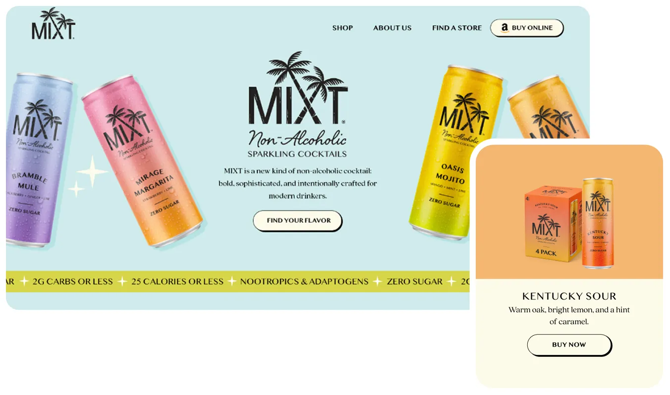
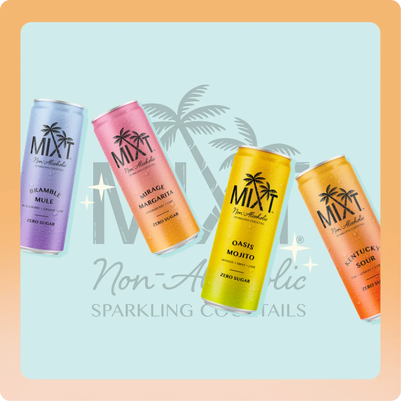
We partnered with MIXT to launch a premium non-alcoholic cocktail brand into a fast-growing category and turn first-time curiosity into repeat purchase.
MIXT needed a digital home that could carry the sophistication of a real cocktail experience without the alcohol, speaking to a mindful-drinking audience that wants flavor and function, not compromise.
The challenge was standing out in an emerging space where most brands lean on wellness claims and forget the taste.
Through positioning, UX, and conversion-focused design, we built a store that leads with flavor, proves the premium promise, and moves shoppers cleanly toward their first pack. Visit Website.
Process
Flavor-First Product Storytelling
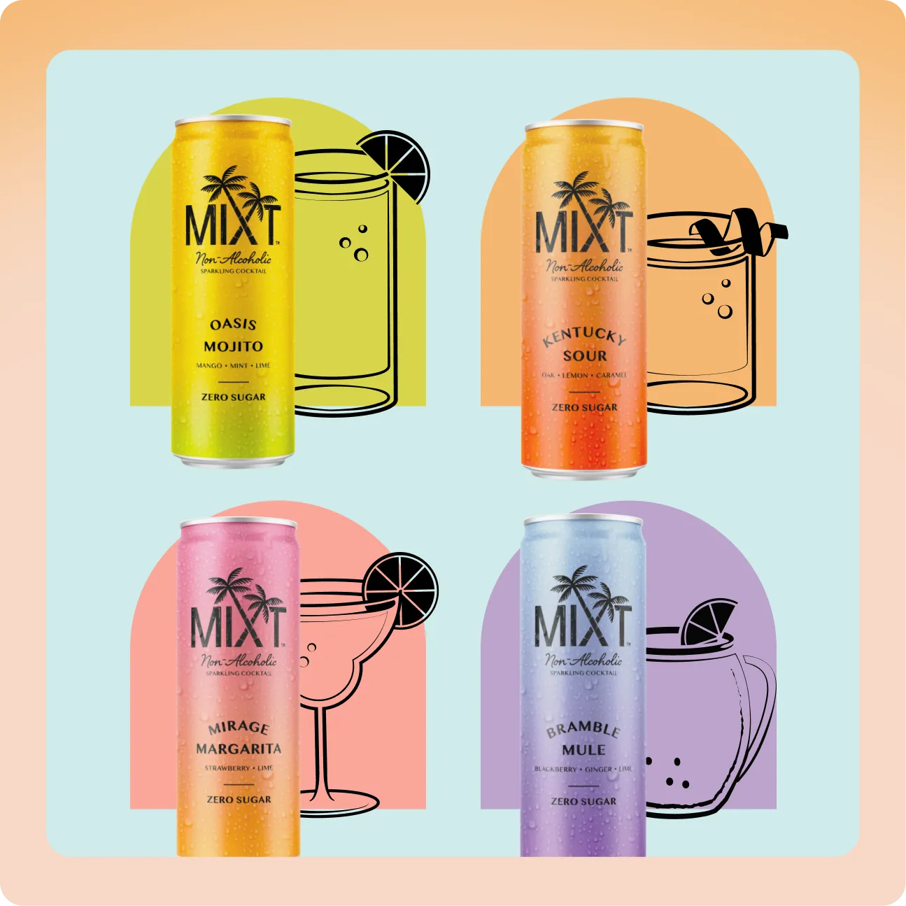
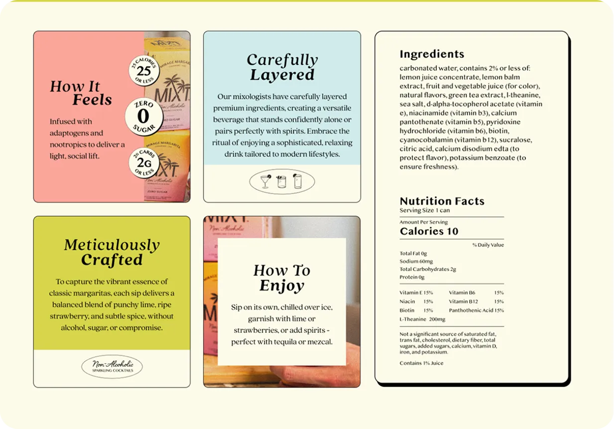
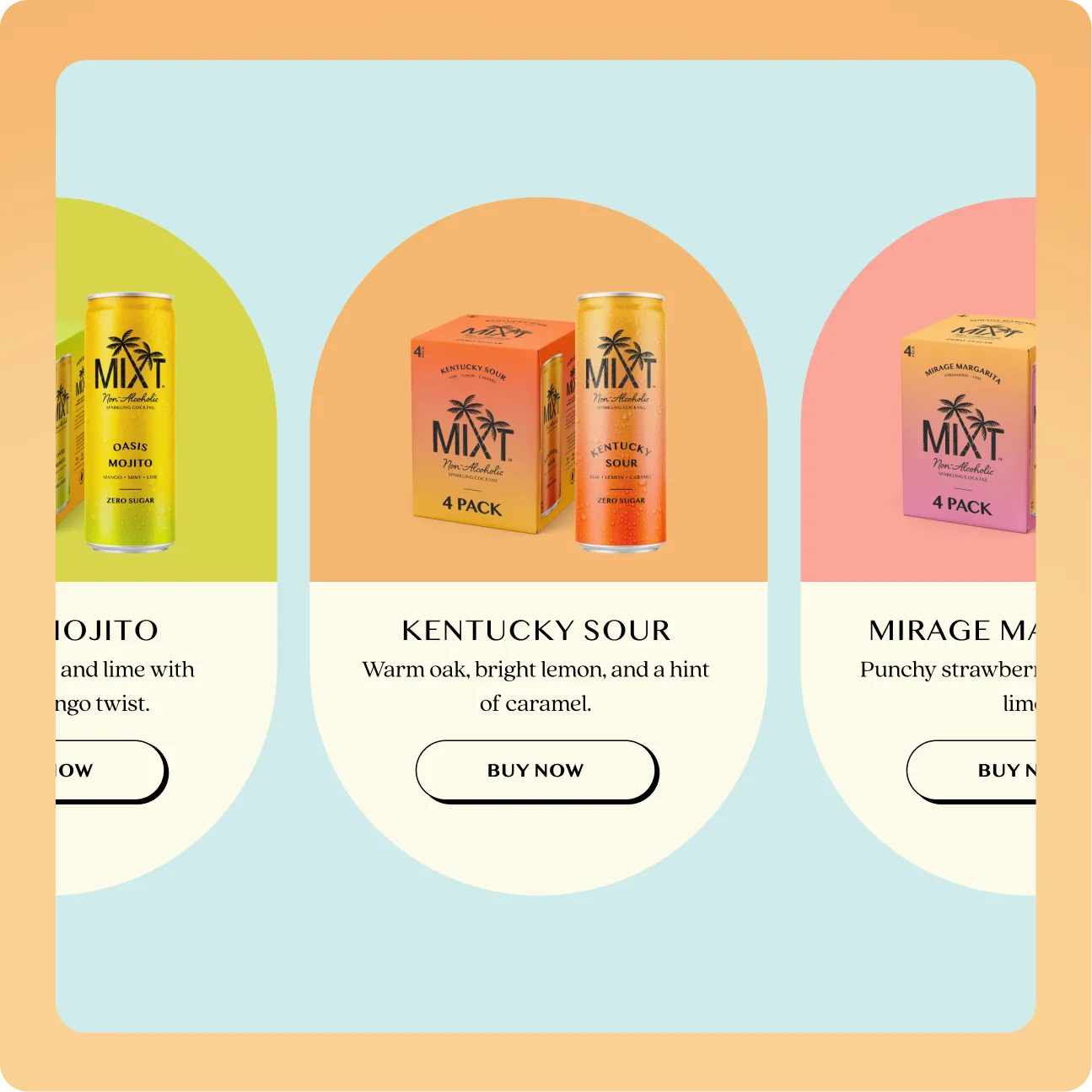
Every flavor leads with taste and mood, not a spec sheet. Product cards, hero copy, and detail pages open with the sensory promise, punchy lime, warm oak, bright mint, and only then reinforce the functional proof. Shoppers feel the experience before they scan the numbers, which is exactly how a premium drink earns trial.
A Conversion Path Built for Launch
Because early sales run through Amazon and retail, the site is structured to hand off intent at the right moment. Clear "Buy Online" and "Find a Store" actions sit exactly where consideration peaks, reducing the friction of a fragmented purchase journey and protecting momentum from the homepage all the way to checkout.
Premium Feel, Playful Energy
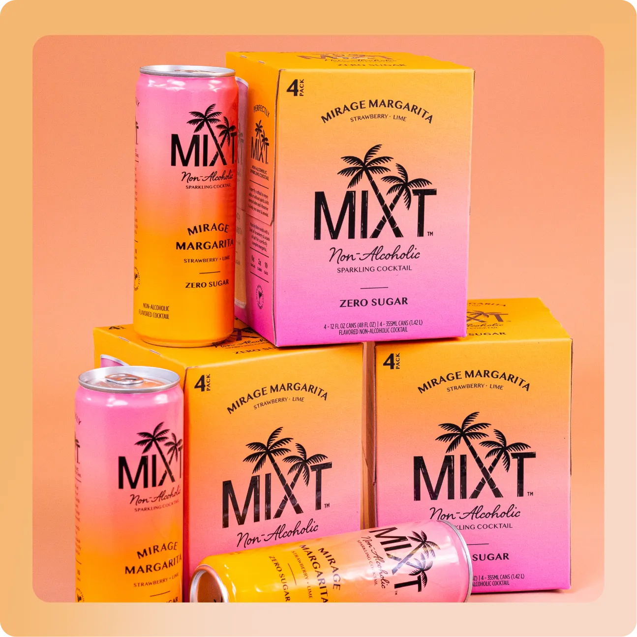
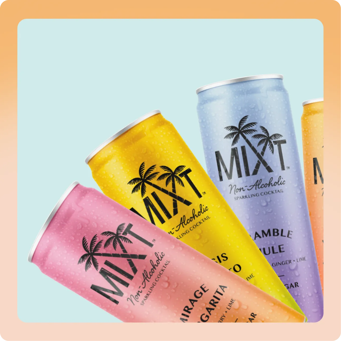
The brand had to read premium without feeling stiff, and fun without feeling cheap. A confident type system, generous spacing, and a bright but controlled palette give MIXT a mixologist-grade polish while keeping the tone social, inclusive, and easy to enjoy.
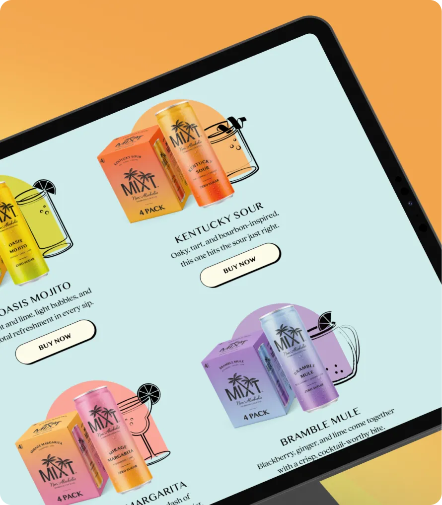
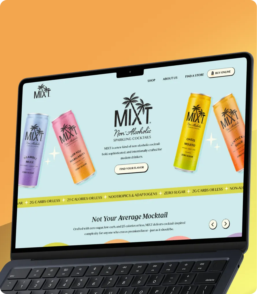
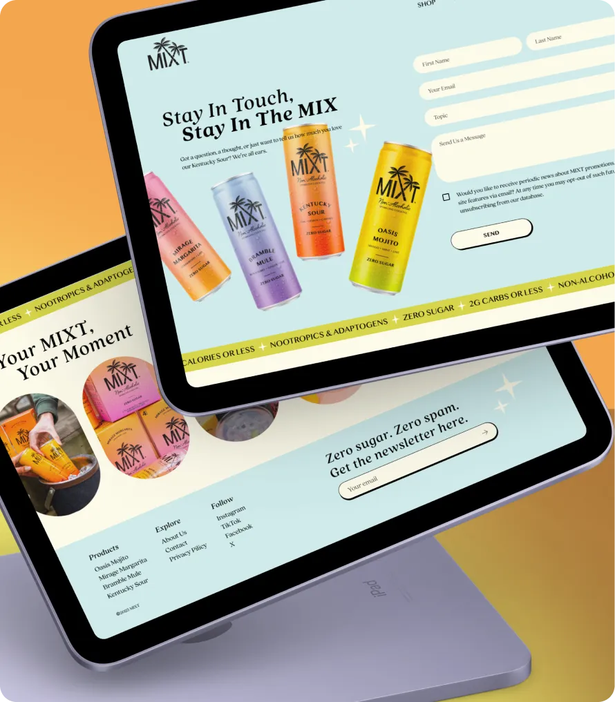
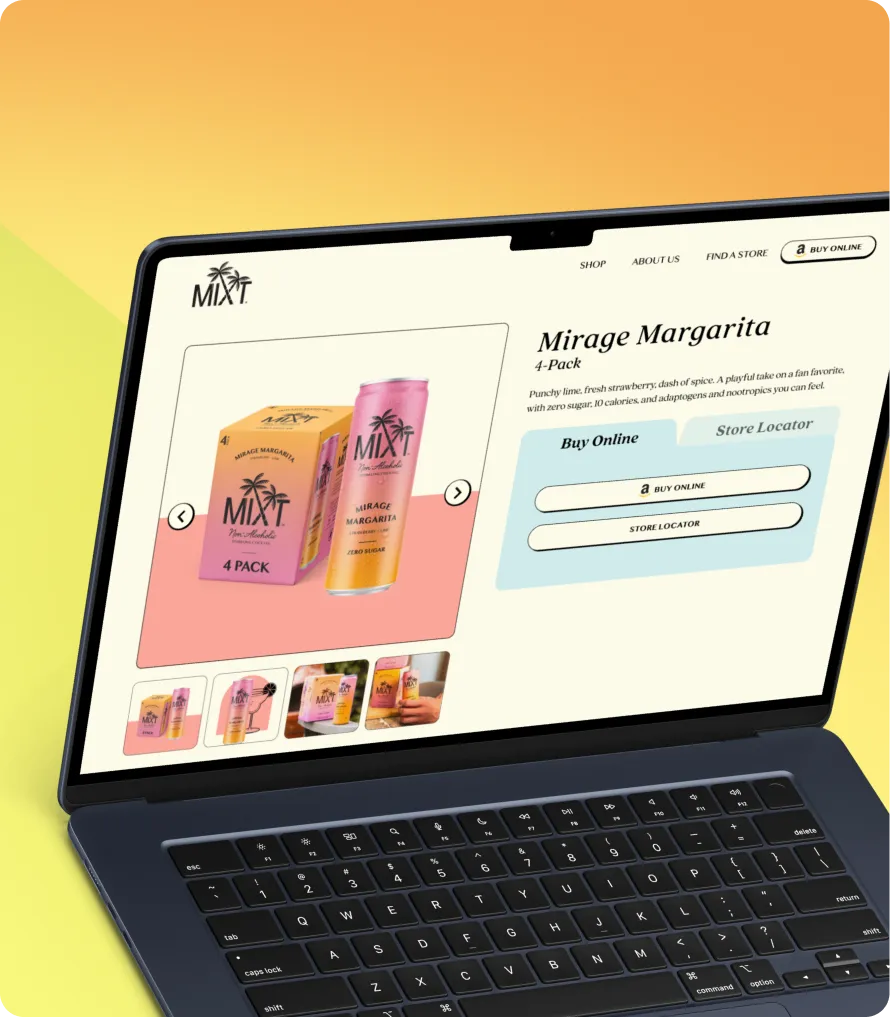
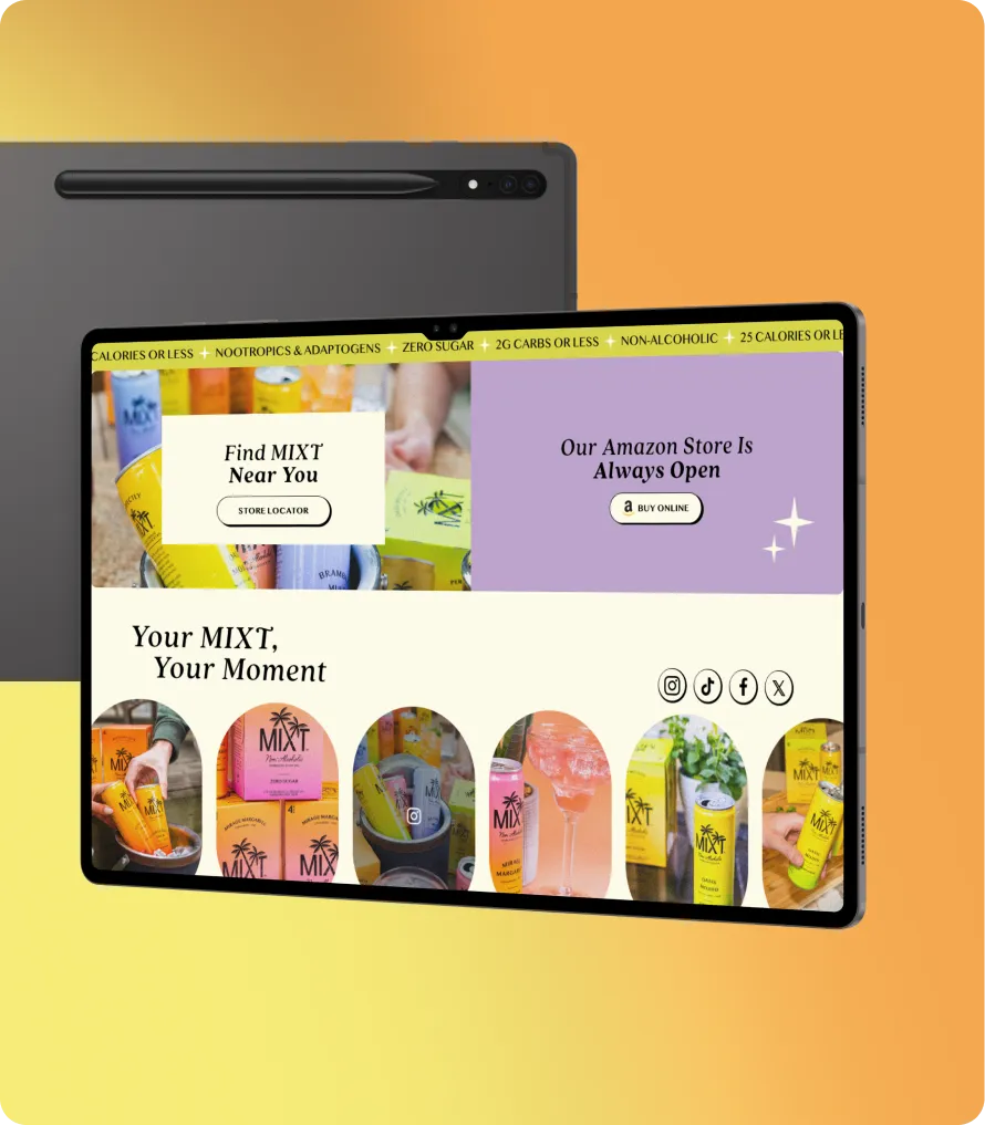
The MIXT store was built around a single, simple job: make a new kind of drink feel instantly desirable and effortless to buy. Instead of overwhelming shoppers with claims, the layout moves from flavor, to proof, to purchase in a clear rhythm, letting each section do one thing well and guiding people confidently toward their first order.
Color Palette
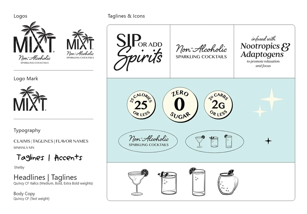
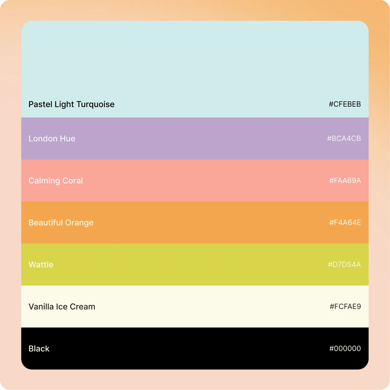
A soft, calming base is paired with a set of bright, energetic accents, one tuned to each flavor. The result feels premium and clean while still reading as fun, playful, and unmistakably social.
Typography
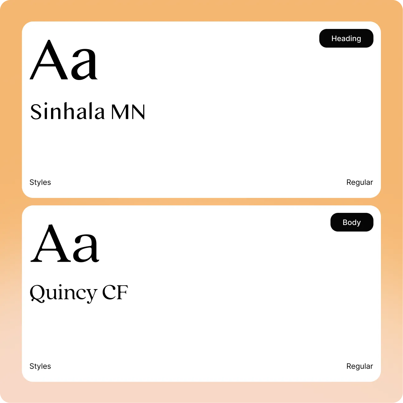
A characterful display face carries headlines and flavor names with personality and lift, while a clean, readable companion handles body copy. The pairing keeps the experience feeling crafted and editorial without ever getting in the way of the message.
Closing
Across the site, oversized flavor names, product-forward imagery, and consistent buy actions turn browsing into buying. Award badges, functional-benefit cues, and social proof are placed exactly where hesitation tends to appear, so the design does more than look premium. It steadily removes doubt and pushes shoppers toward action.