
Beautiful Design Works Harder. Here’s Why.

When was the last time a website made you stop and think this is beautiful?

From the golden ratio in ancient temples to the symmetry of a flower, beauty has guided human experience for thousands of years. Styles may shift, but one truth has never changed. Beauty affects behavior.
We admire beauty for interconnected reasons rooted in biology, psychology, culture, and philosophy. Evolutionarily, humans are drawn to symmetry, balance, and vitality, as these often signal health and a safe environment. Cognitively, our brains process patterns and order more easily, which feels rewarding and pleasing. Psychologically, beauty stirs emotions such as awe, joy, or peace, offering a sense of escape or transcendence. Culturally, societies shape standards of beauty through art, fashion, and tradition, though common themes like proportion and harmony appear universally.
Research shows that beautiful environments reduce stress, improve focus, and even accelerate recovery. In hospitals, patients surrounded by aesthetically pleasing spaces needed less medication and healed faster than those in outdated, dull environments. In other studies, people reported higher happiness levels not from safety or cleanliness but from how beautiful they found their city.
In web design, the same principle applies. According to research by the Stanford Web Credibility Project, nearly half of users judge a company’s credibility based on the visual appeal of its website. Other studies on the aesthetic–usability effect, conducted by the Nielsen Norman Group, have shown that users perceive attractive interfaces as more usable, even when they function similarly to less attractive ones.
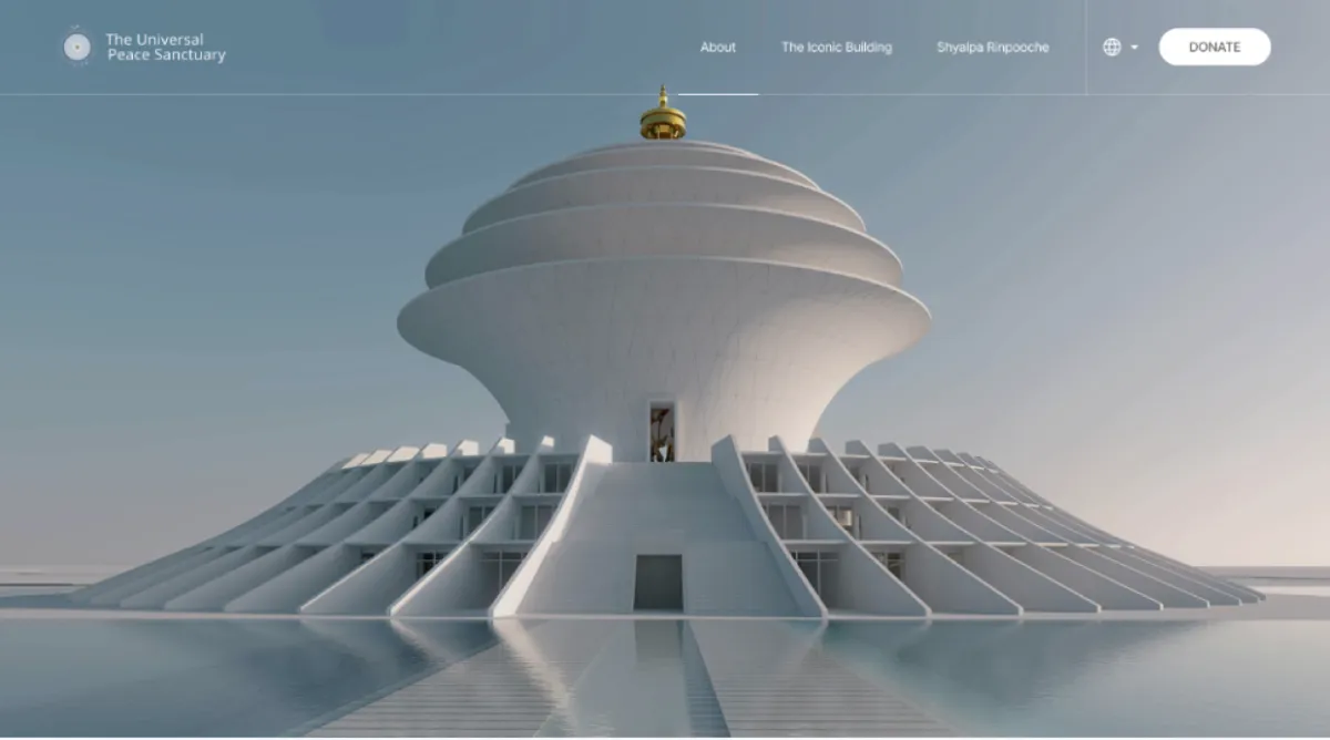
Beauty is not decoration. It is a powerful human need. And if it can improve our physical world experience, imagine what it can do for the digital platforms where we now spend most of our lives. Yet too many websites and apps are built only to be efficient. They technically work but fail to connect. They leave users uninterested or frustrated. At Charly, we believe the best design does more. It makes people feel. It makes them stay.
So what can digital platforms learn from how humans respond to beauty? Let’s break it down into four lessons.
Lesson 1: Symmetry Builds Trust
From the very beginning of human history, symmetry has been a sign of safety. Our ancestors judged healthy plants, animals, and even potential partners by how balanced they appeared. Symmetry told us something was reliable.
The same is true in design. A well-balanced layout immediately feels more trustworthy and easier to navigate. When users sense order and structure, they can relax and focus on the message instead of trying to decode the interface.
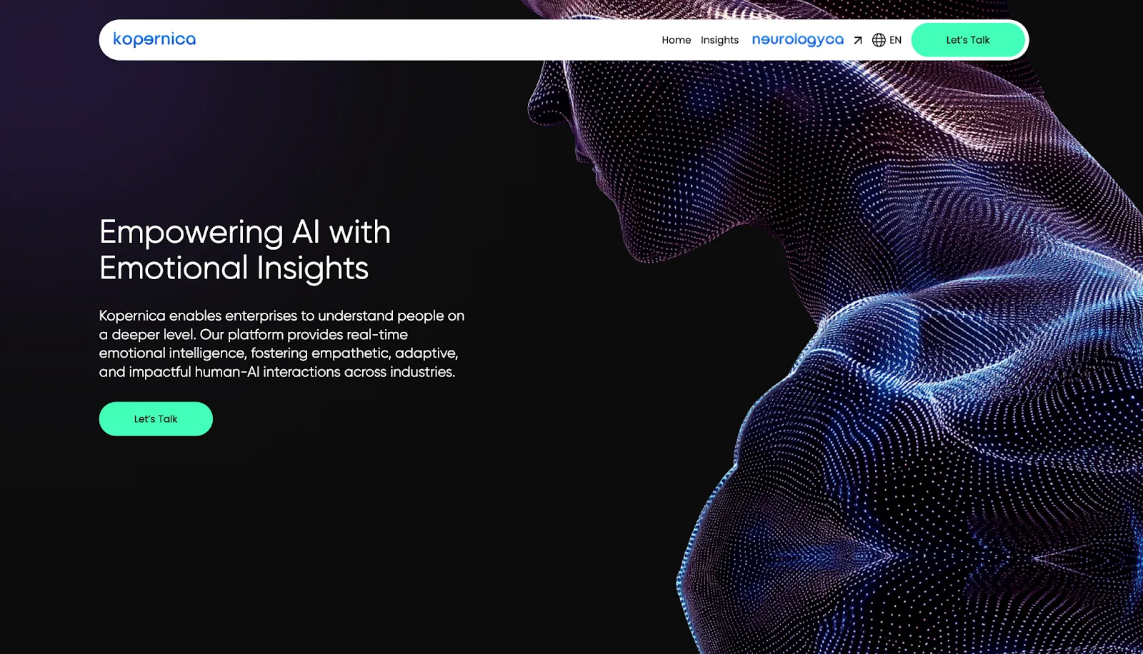
We saw this clearly in our work with Kopernica, an Emotion AI company. Their previous site had too many sections, inconsistent visuals, and a weak hierarchy. It made a groundbreaking technology feel confusing. By redesigning with balance and rhythm, reducing 15 scattered blocks to 10 streamlined sections, we created a flow that felt premium, credible, and emotionally intelligent. Symmetry turned clutter into clarity.
Before:

After:
Lesson 2: Patterns Create Recognition
Fractals and patterns appear everywhere in nature. Waves, shells, trees, clouds. Humans evolved to recognize these patterns because they helped us predict survival outcomes. If clouds looked a certain way, rain was coming. If shells spiraled in a certain form, they were safe to eat. Recognizing patterns made life easier.
On digital platforms patterns do the same. Consistent design choices reduce cognitive load. Users quickly learn what to expect and where to act. Repeated modules for benefits, reviews, or CTAs guide them smoothly without effort.
We applied this principle in our CrossFit landing page redesign. The original version felt scattered and inconsistent, making it harder for visitors to trust the experience. In the redesign, we introduced recognizable modules for testimonials, FAQs, and value pillars. Each block was structured for quick scanning, predictable flow, and consistent calls to action. This transformed the page from overwhelming to intuitive, giving users clear signposts at every step.
👉 See the full CrossFit Case Study here.

Lesson 3: Design Shape Emotion
Monotony makes us miserable. Studies have shown that rows of blank concrete walls increase stress, while beautiful architecture improves mood and cognitive function. Our surroundings shape our emotions more than we often realize.
The digital environment is no different. A lifeless website may function, but it fails to inspire. Users bounce because it feels empty. But when a digital space carries emotion, people linger. They explore. They trust.
Take the website https://sweetinfluencers.ai.
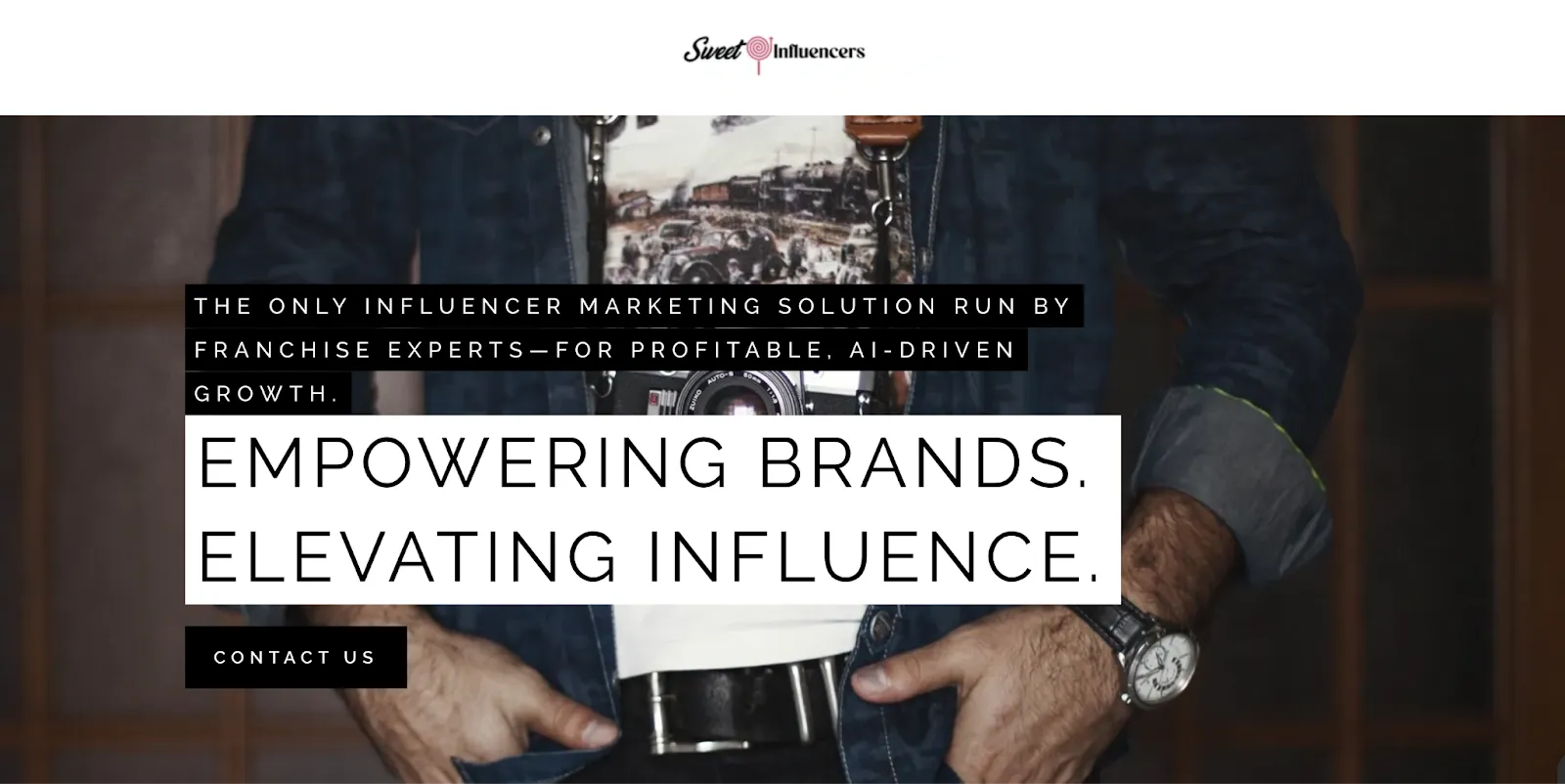

Technically, it works. The structure is there, the information is available, and the product can be understood. Yet the experience feels bare and disconnected. It relies on stark layouts, limited visual rhythm, and generic presentation. The result is a site that functions, but does not invite users to engage emotionally. It misses the chance to connect.
Beauty makes people connect with positive feelings. In fact, research has shown that individual happiness is more influenced by how beautiful a city feels than by its safety or cleanliness. Beauty is not only about aesthetics, it is about how we connect to the world.
Digital platforms also carry this responsibility. A beautiful website makes visitors feel at ease. It communicates care. It builds loyalty.
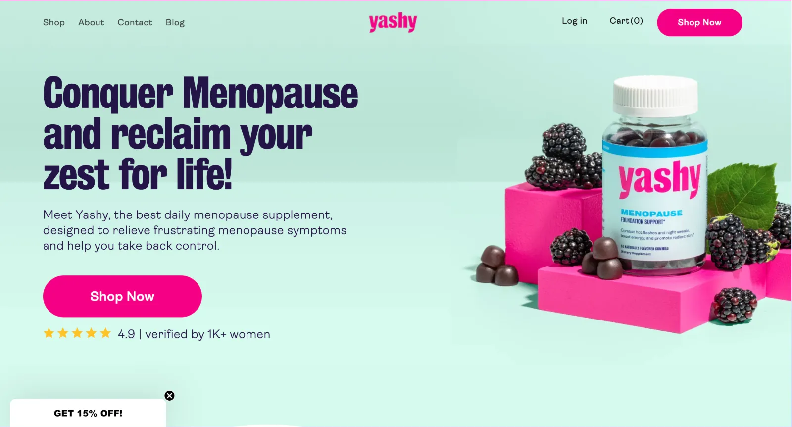
For Yashy, beauty became a bridge to trust. We refined their vibrant palette with soothing secondary tones, introduced curved UI elements for warmth, and rewrote content with empathy. The result was not just an e-commerce store. It became a safe and reassuring destination for women navigating one of life’s most personal journeys. Beauty created a sense of connection that a purely functional site never could.
Lesson 4: Making Your Brand Memorable Pays Off: The ROI Case for Beauty
Beauty in design is not only about how a site feels. It also affects how it performs. Multiple studies have shown that visually appealing interfaces improve trust, increase conversions, and reduce bounce rates. Research by Google found that users form an impression of a website’s visual appeal in less than 50 milliseconds. If that first impression is negative, most visitors will never return.
The Stanford Web Credibility Project also discovered that 46 percent of people judge a company’s credibility based on its website design alone. In other words, even the most functional site can fail to convert if it does not also feel beautiful and credible.
The Nielsen Norman Group’s work on the aesthetic–usability effect reinforces this point: users consistently perceive beautiful interfaces as easier to use, even when they are functionally identical to less attractive ones.
For brands, this translates into measurable ROI. When UI is redesigned with beauty and clarity in mind, companies see higher engagement and conversion metrics. Call-to-action buttons stand out more, navigation flows feel smoother, and content becomes easier to digest. A beautiful interface is not just pleasing to the eye, it is a business advantage.
We have seen this in our own work. In the Granola case study design improvements such as clearer layouts and optimized product storytelling helped simplify navigation and boost conversions. In the Universal Peace Sanctuary case study refinements in color systems, typography, and layout elevated the brand’s online presence, increasing trust and donor engagement. These results show that beauty in design does not only improve perception, it directly drives performance.


The Takeaway
Humans are programmed to seek beauty. We find it in symmetry, in patterns, in inspiring environments, and in connections that make us feel seen. Beauty is not extra. It is not surface level. It is a survival mechanism that still drives behavior today.
In digital design functionality makes a site usable, but beauty makes it unforgettable. Function creates clarity. Beauty creates connection. Together they transform digital experiences from forgettable to inspiring.
At Charly we exist to make sure your brand is not only seen but remembered.

Managing Director
You May Also Like


