From Mission to Action: UX Design Tips for Nonprofit Success
In today's digital world, a nonprofit's website does much more than simply exist online. It's the organization's hardest-working team member, operating 24/7 to introduce new supporters to the mission, share impact stories, and convert visitors into donors and volunteers.
Your website is often someone's first interaction with your cause. Within seconds, visitors decide whether to stay and learn more or click away to something else. When your website is confusing, slow, or doesn't connect emotionally, you're essentially putting up roadblocks between your mission and the people who want to support it.
But when nonprofits invest in thoughtful UX strategy, something powerful happens. By focusing on accessibility, creating genuine emotional connections, and designing clear pathways for action, organizations can turn their websites into magnets for the right supporter, those who become monthly donors, dedicated volunteers, and passionate advocates.
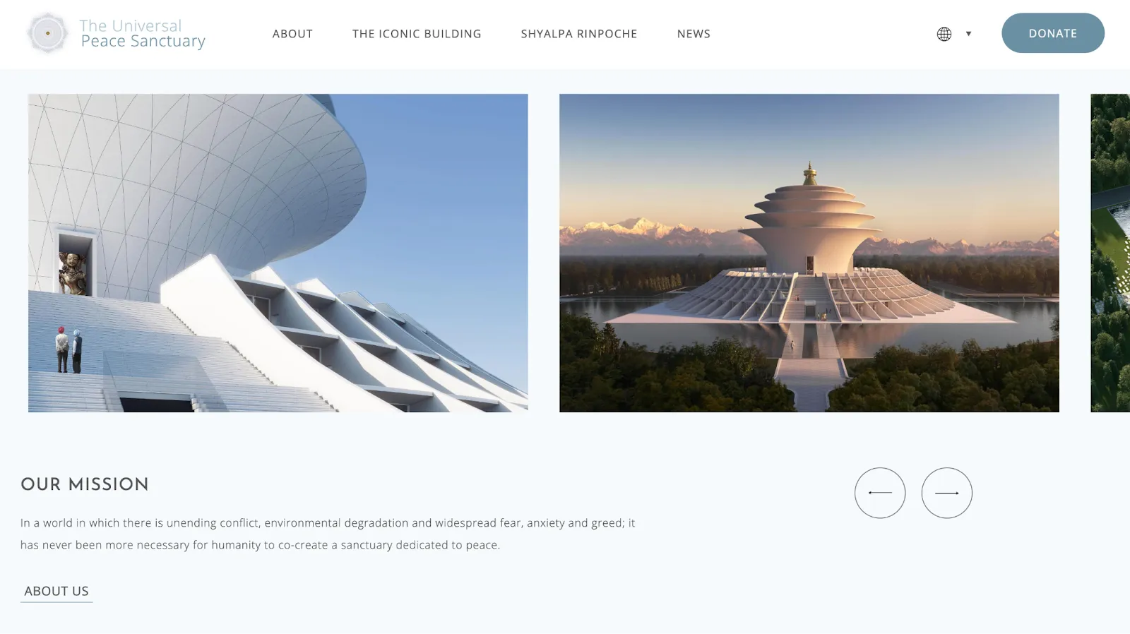
In this article, we'll dive into the best UX practices for nonprofit websites, from crafting a compelling mission statement to optimizing donation flows, so your organization can maximize its digital presence and impact.
What’s in it for me? The key question in both business and non-profit
Our UX approach always prioritizes user goals and clearly addresses the user's core question: "What's in it for me?" By deeply understanding user behaviors and motivations through research, persona creation, usability testing, and iterative design, we consistently deliver intuitive and engaging websites that resonate with users across all industries.
For non-profits, our UX approach emphasizes measurable impact through:
- Mission & Community: Clearly communicate your organization's impact.
- Accessibility: Inclusive design optimized for mobile and accessible to diverse audiences.
- Trust & Transparency: Open communication (e.g., about how the organization is run, how money is spent) and benefits to build trust and strengthen community support.
- Simplified Engagement: Streamlined pathways for donations, volunteering, and community participation.
- Community Building: Facilitate meaningful connections, ensuring long-term participation and support. We may recommend community platforms like Circle.so to foster deeper engagement and connection.
- User-Focused Design: Research-driven, personalized solutions to resonate deeply with users.
- Resource Efficiency: Smart, impactful solutions utilizing effective tools to maximize outcomes with available resources.
Source: https://morweb.org/post/best-nonprofit-websites
1. Clear and Engaging Mission Statement
- Clearly articulate your mission on the homepage.
- Use concise and compelling language to quickly communicate your core purpose and value.
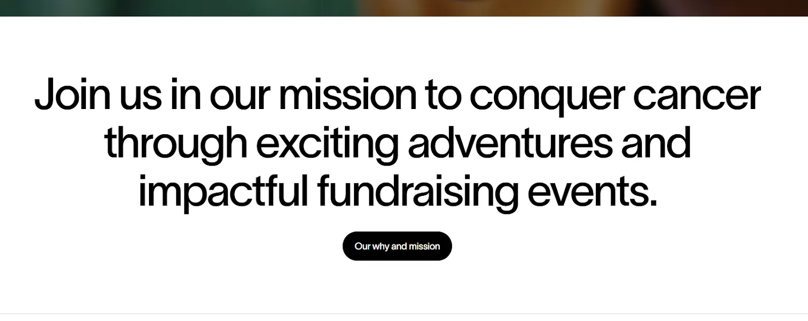
Radiating hope does this well by putting their mission on the section of their homepage.
Source: https://www.radiatinghope.org/
2. Prominent Calls to Action (CTAs)
- Make donation buttons easy to find and use, with contrasting colors.
- Clearly label action buttons (Donate, Volunteer, Sign Up).
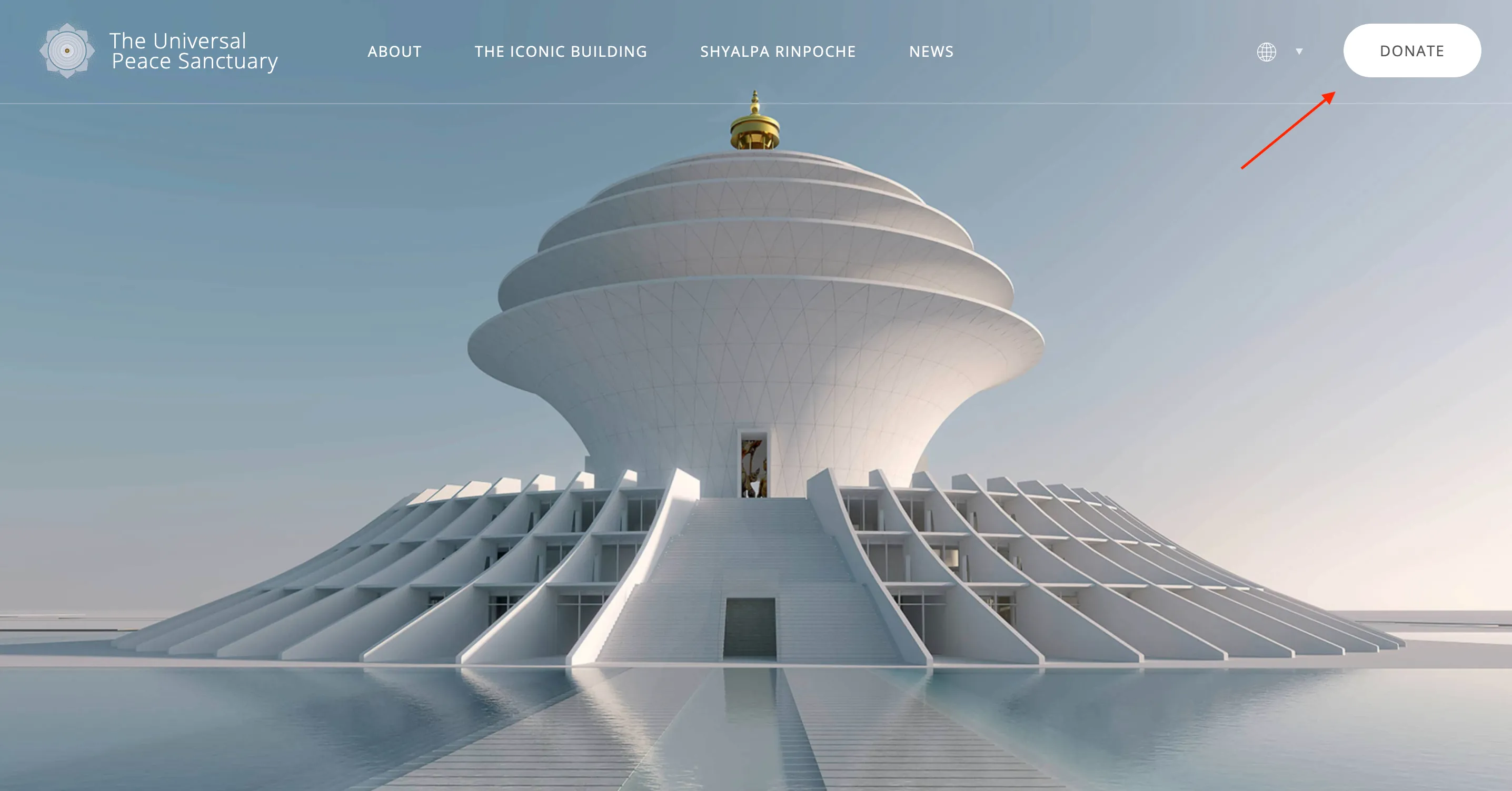
The Universal Peace Sanctuary does this well by putting a ‘Donate Button’ in a color that’s noticeable and branded, and also by keeping the top navigation sticky as the user scrolls down, and it has an attractive hover effect.
3. Simple, User-Friendly Navigation
- Keep the menu straightforward with clear categories (About, Donate, Programs, Volunteer, Contact).
- Include a secondary navigation for less frequent but important pages.

Radiating Hope demonstrates clean, intuitive navigation with clearly labeled categories—“About,” “Events,” and “Get Involved”—plus two high-contrast CTAs (“Ask for help” and “Contact us”) that float visibly on the homepage.
A subtle secondary bar at the top promotes timely content (“Everest Base Camp Trek”), effectively blending core and campaign-specific links without cluttering the UI.
This layout ensures that both first-time and returning users find what they need quickly.
Source: https://www.radiatinghope.org/
4. Accessibility and Inclusivity
- Adhere to WCAG (Web Content Accessibility Guidelines) standards.
- Ensure readability through adequate font size, contrast, and alternative text for images.
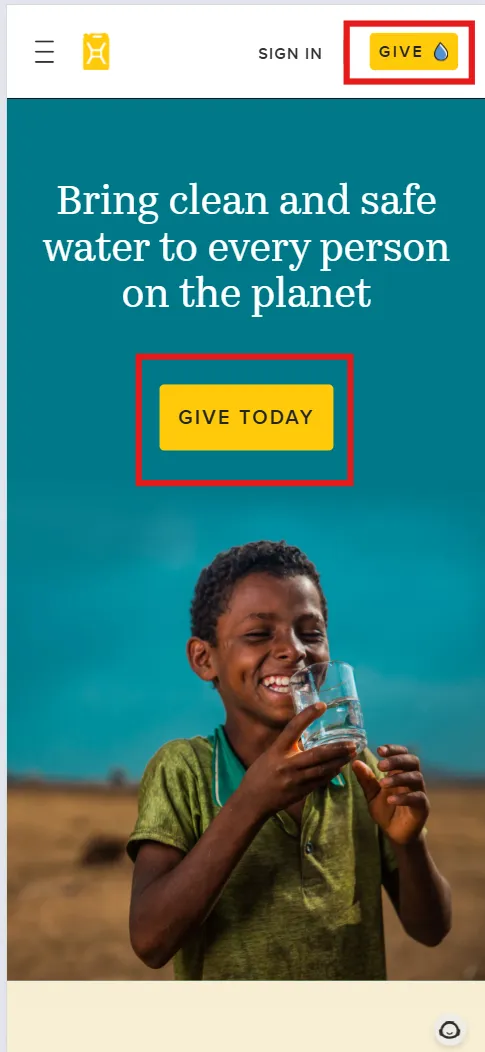
Charity: water demonstrates excellent accessibility through:
- Strong color contrast: The bold yellow “GIVE TODAY” CTA stands out against the teal background.
- Large, legible fonts: Text is highly readable on small screens, supporting inclusive design.
- Clear hierarchy: The visual layout guides users smoothly from the mission statement to action.
These choices enhance usability for all visitors, including those with visual or cognitive impairments.
Source: charitywater.org
5. Responsive and Mobile-Friendly Design
- Optimize for seamless browsing on mobile devices.
- Simplify navigation and donation processes for mobile users.
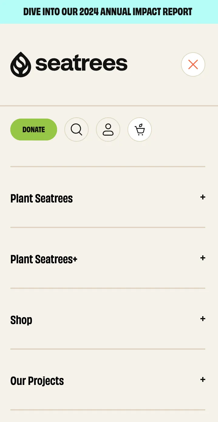
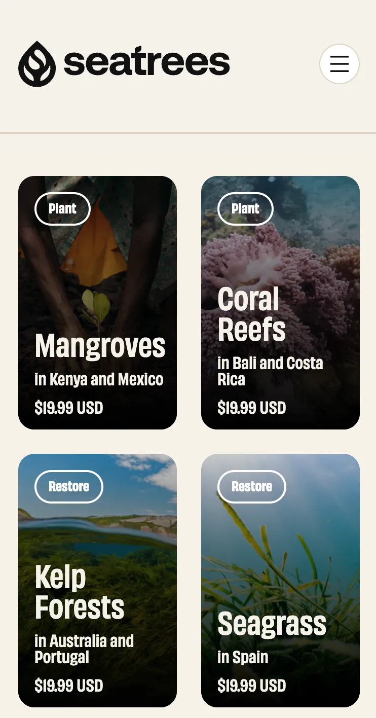
SeaTrees demonstrates excellent mobile responsiveness through a clean, flexible layout that adjusts naturally to smaller screens. Key UX elements like their hamburger menu, tappable donation button, and modular "Plant & Restore" cards are all designed with mobile users in mind. Each card is clearly legible, with ample spacing and direct CTAs (e.g., "From $10.00"), ensuring the giving process is intuitive from any device.
Source: https://seatrees.org/
6. Storytelling and Visual Impact
- Use compelling visuals (photos, videos, infographics) to emotionally engage visitors.
- Share personal stories or testimonials to showcase impact.
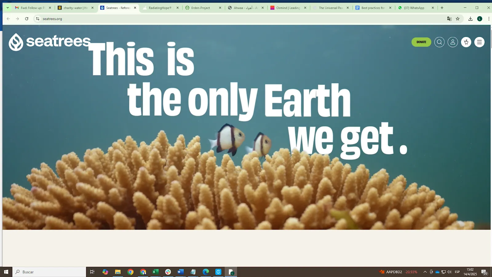
SeaTrees opens their homepage with a bold, full-width hero video and the message “This is the only Earth we get.” overlaid on an underwater coral reef scene with fish swimming—immediately immersing the user in their environmental mission.
Earlier in the page, we see vibrant scenes of real volunteers harvesting kelp, which anchors the abstract idea of “restoration” in human hands. Scroll further and you're presented with a grid of beautifully photographed ocean solutions—“Mangroves in Kenya,” “Seagrass in Spain”—each tied to a donation value.
Source: https://seatrees.org/
7. Transparency and Trust
- Clearly display financial transparency (annual reports, impact reports).
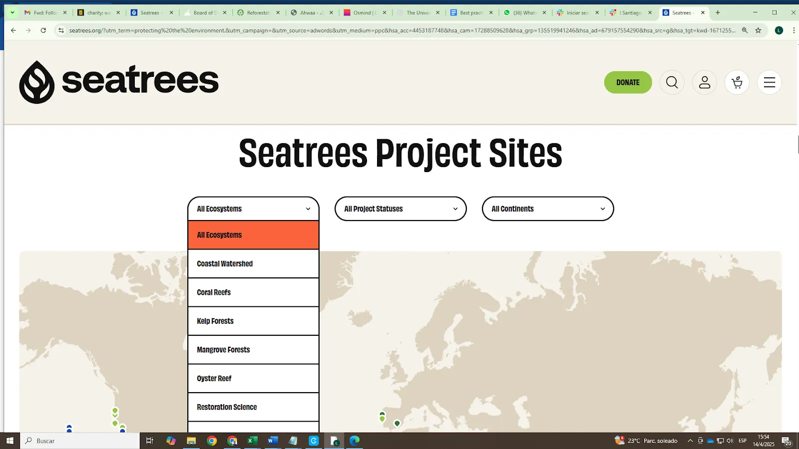
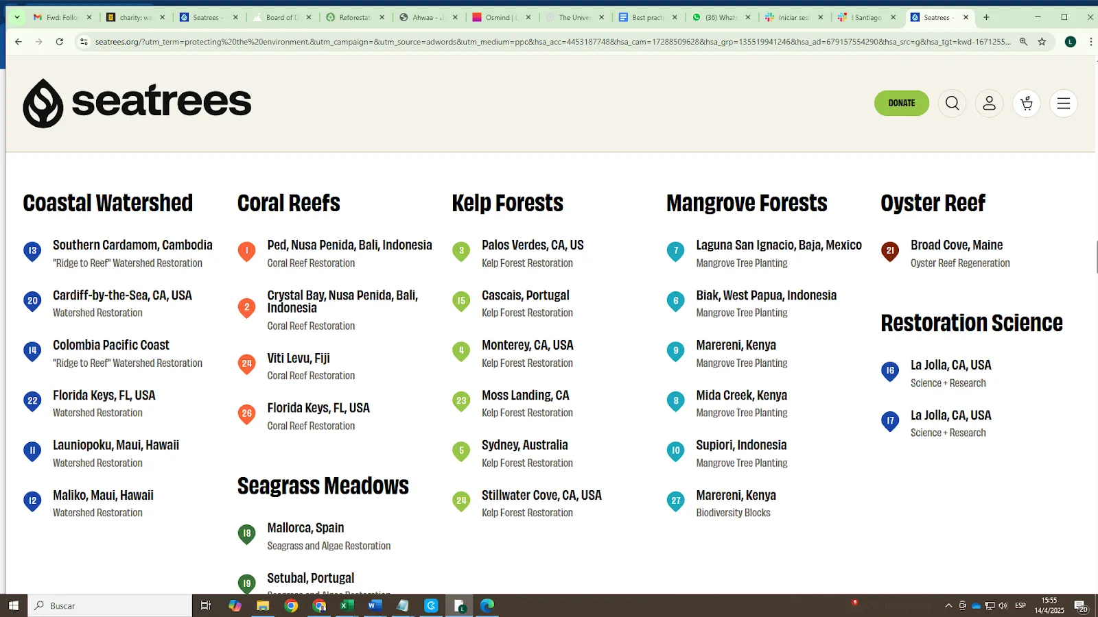
SeaTrees enhances transparency through an interactive project tracking interface that allows users to browse current work by ecosystem, project status, and continent. A live world map and filterable index let users explore detailed restoration efforts—from coral reefs in Fiji to mangroves in Kenya.
This format goes beyond static reports, inviting visitors to see the breadth of activity for themselves. By placing transparency in the user's hands, SeaTrees builds trust through openness and usability, empowering informed giving.
Source: https://seatrees.org
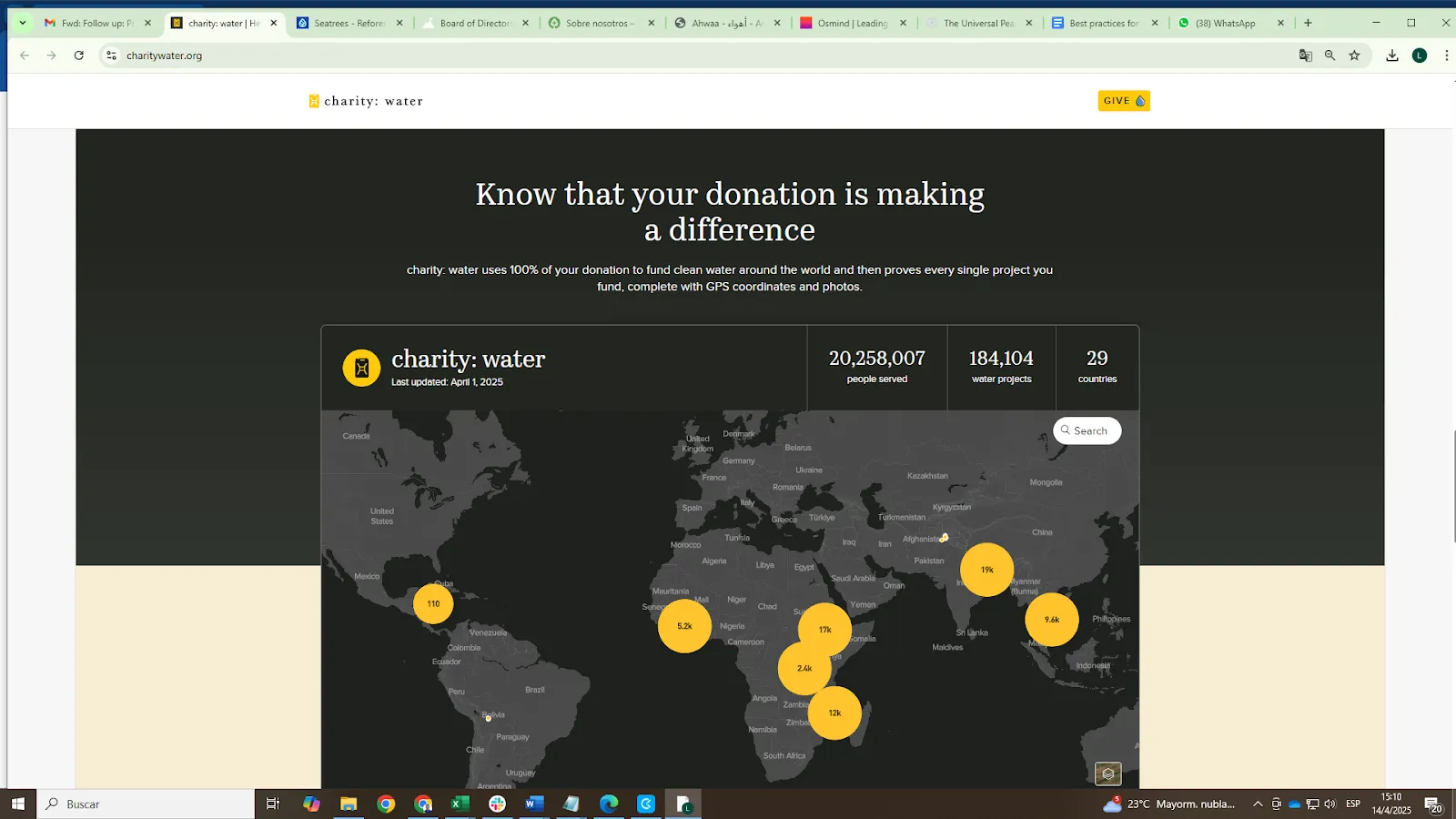
Charity Water’s homepage features a dynamic global map showing exactly where each donation goes, backed by real-time data (e.g., “184,104 water projects,” “20,258,007 people served”). This transparency is reinforced by their “100% model” messaging, with GPS coordinates and photos proving the impact of every dollar.
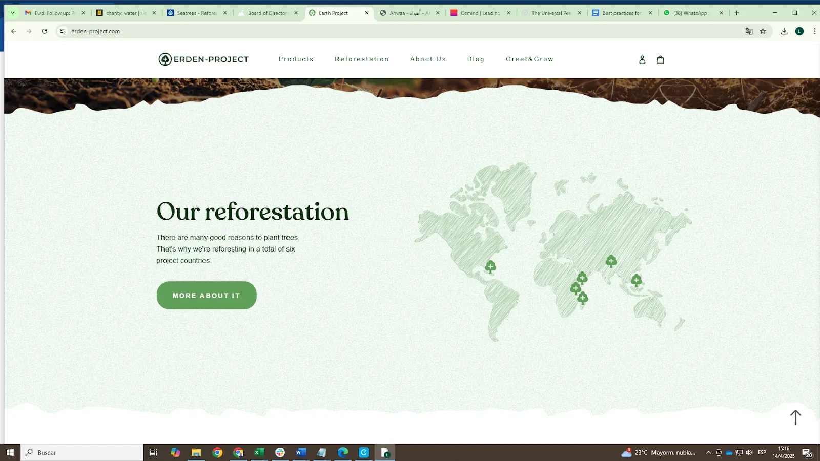
Additionally, Erden Project contributes to transparency by showing a simplified world map that highlights the geographic scope of their reforestation work across six countries. While less data-heavy than Charity: Water, this visual transparency quickly communicates global reach and distribution.
Source: https://erden-project.com
- Include trust indicators such as partnerships, accreditations, or testimonials.
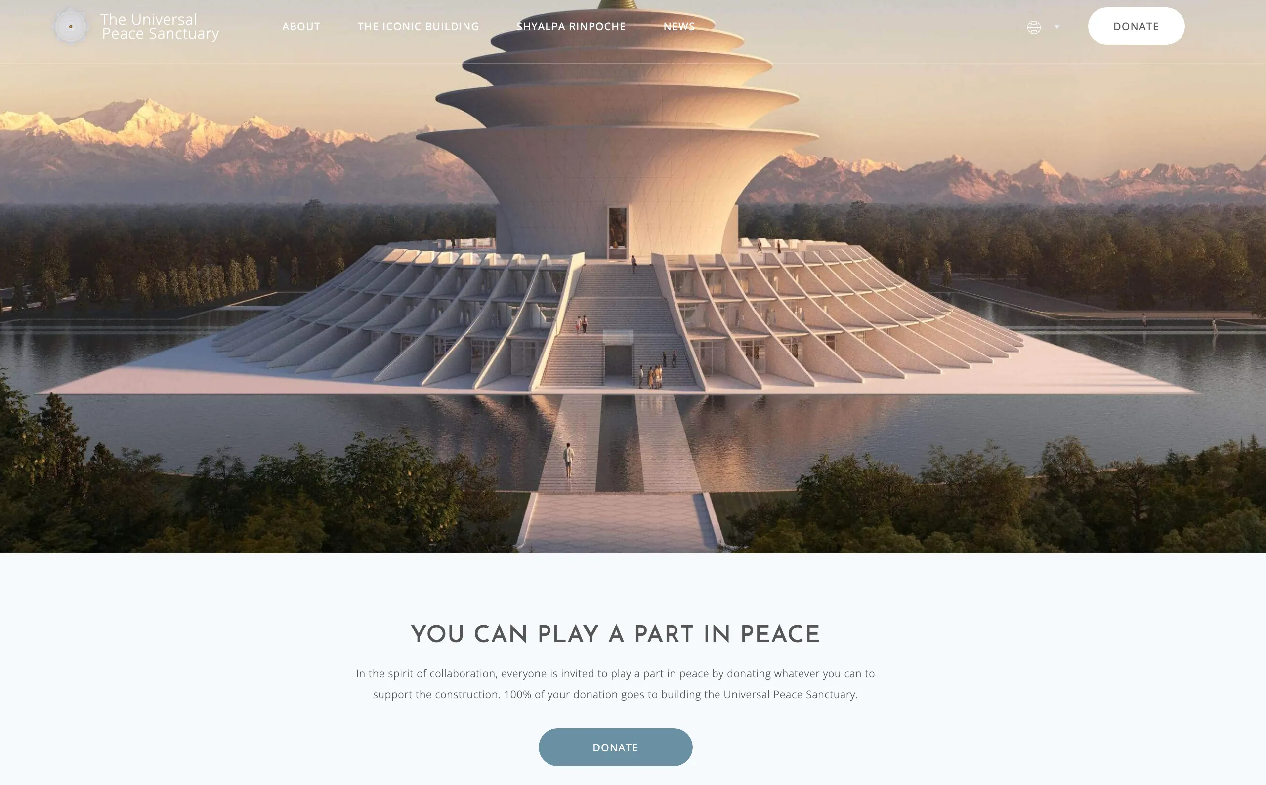
The Universal Peace Sanctuary uses affiliation and clarity to build trust with potential donors. The message is direct: “100% of your donation goes to building the Universal Peace Sanctuary”—a clear, powerful statement of transparency.
Just below, the presence of well-known media logos (e.g., Bloomberg, Yahoo Finance, International Business Times, Nasdaq) subtly signals credibility and international visibility. This kind of social validation helps establish reputability, especially for newer or large-scale projects.
Combined with a calm and minimalist visual design, the section feels sincere and confidently understated—ideal for donor reassurance.
Source: https://peacesanctuary.org
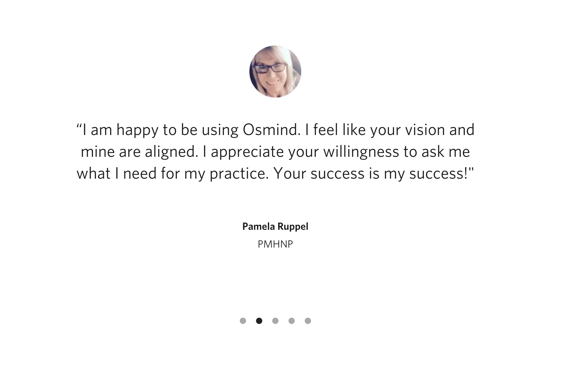
Osmind builds trust and reinforces its value through authentic client testimonials featured prominently on its site. This carousel section includes personal feedback from medical professionals.
Source: https://www.osmind.org
8. Optimized Donation Process
- Keep donation forms concise and intuitive.
- Offer multiple payment methods and set clear expectations for how donations will be used.
Charity: Water’s donation frequency is toggleable (Give Once / Monthly), and amounts are pre-set with a clean UI, including options for custom giving, project sponsorship, and even crypto or check payments. Above all, the copy is intentional: “Every penny counts,” and “100% of your gift funds clean water,” reinforcing impact and transparency at the point of action.
Source: https://www.charitywater.org/donate
Charity: Water presents users with a wide variety of donation pathways, all visually engaging and easy to understand. The “Ready to take action?” section breaks down giving into tangible options: Join Monthly Giving, Start a Fundraiser, Give for a Fundraiser, Plan for Legacy Giving, and more. Each card is distinct and illustrated with real, emotive photography to appeal to different types of donors.
The interface is swipeable, cleanly structured, and the calls-to-action are brief and clear—no clutter, no confusion. This diversity of giving options meets users where they are, whether they’re casual supporters or long-term philanthropic planners.
Source: https://www.charitywater.org
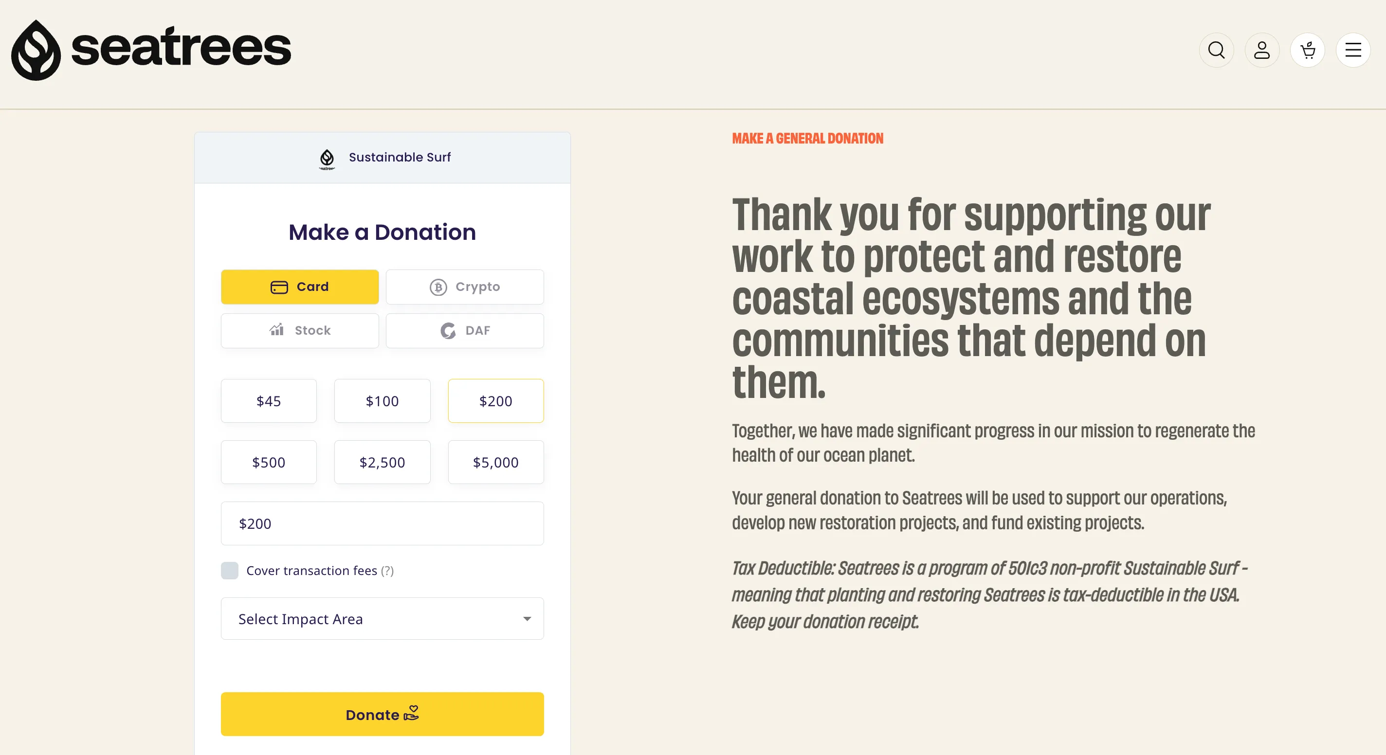
SeaTrees offers a clear and flexible donation experience. The minimalist form supports multiple payment methods—Card, Crypto, Stock, and DAF—with easy tab selection.
Pre-set amounts (from $45 to $5,000) streamline the process, while users can also enter custom values, cover fees, and choose an impact area.
The right-side message explains how donations are used and confirms tax-deductibility, reinforcing trust with an appreciative, action-driven tone.
Source: https://seatrees.org/
9. Consistent Branding
- Maintain visual consistency with colors, logos, typography, and imagery.
- Ensure messaging tone aligns with organizational values and audience expectations.
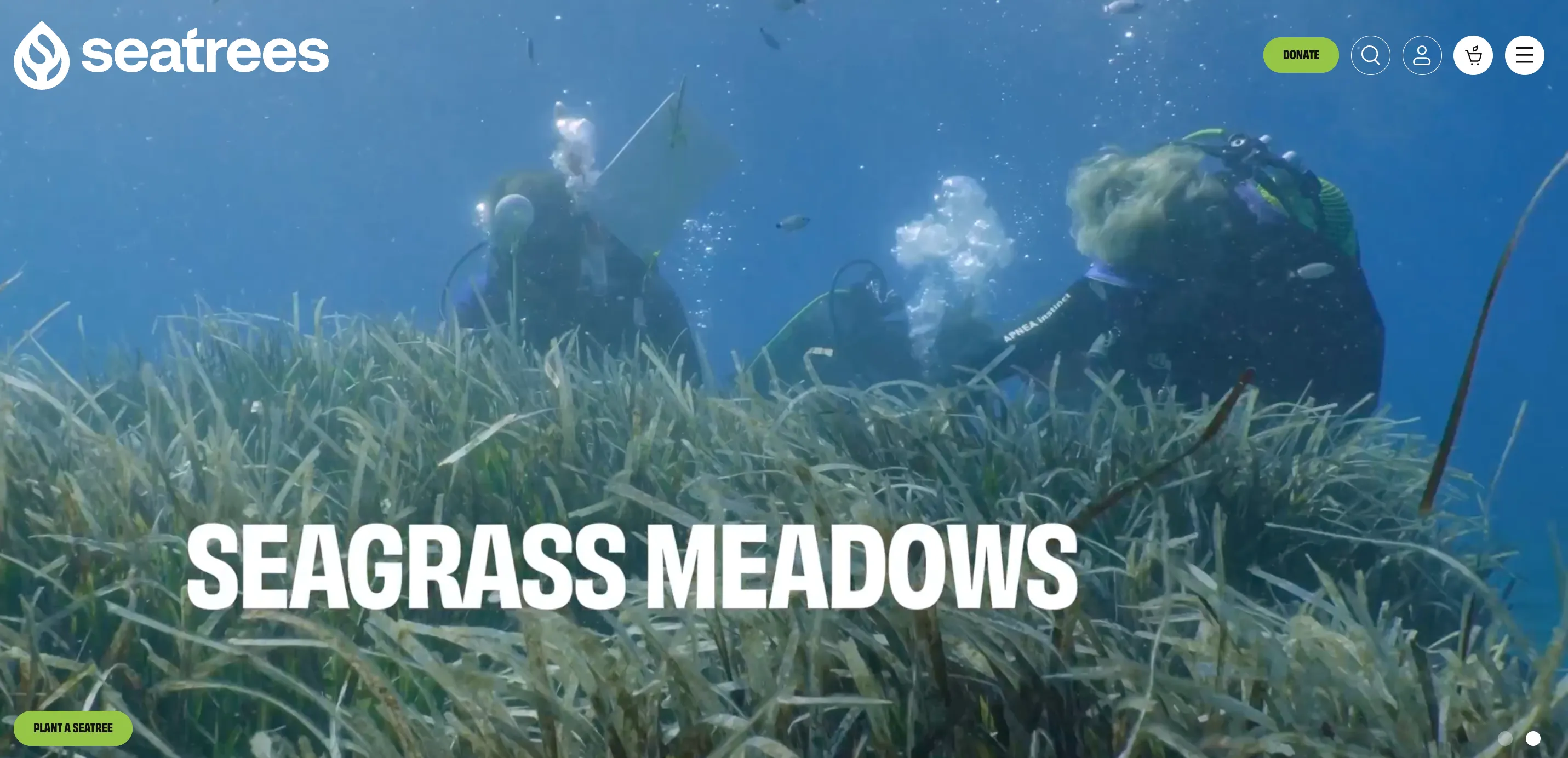
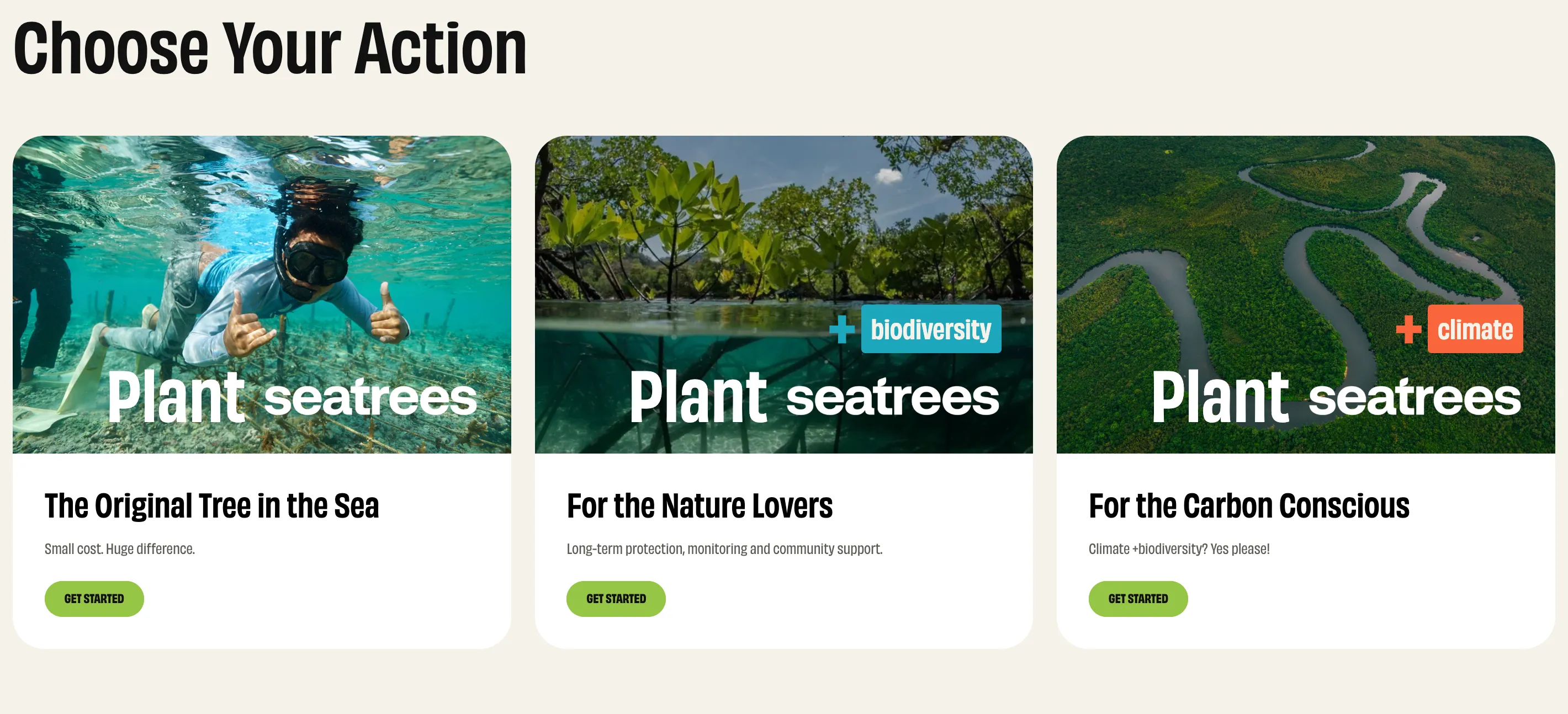
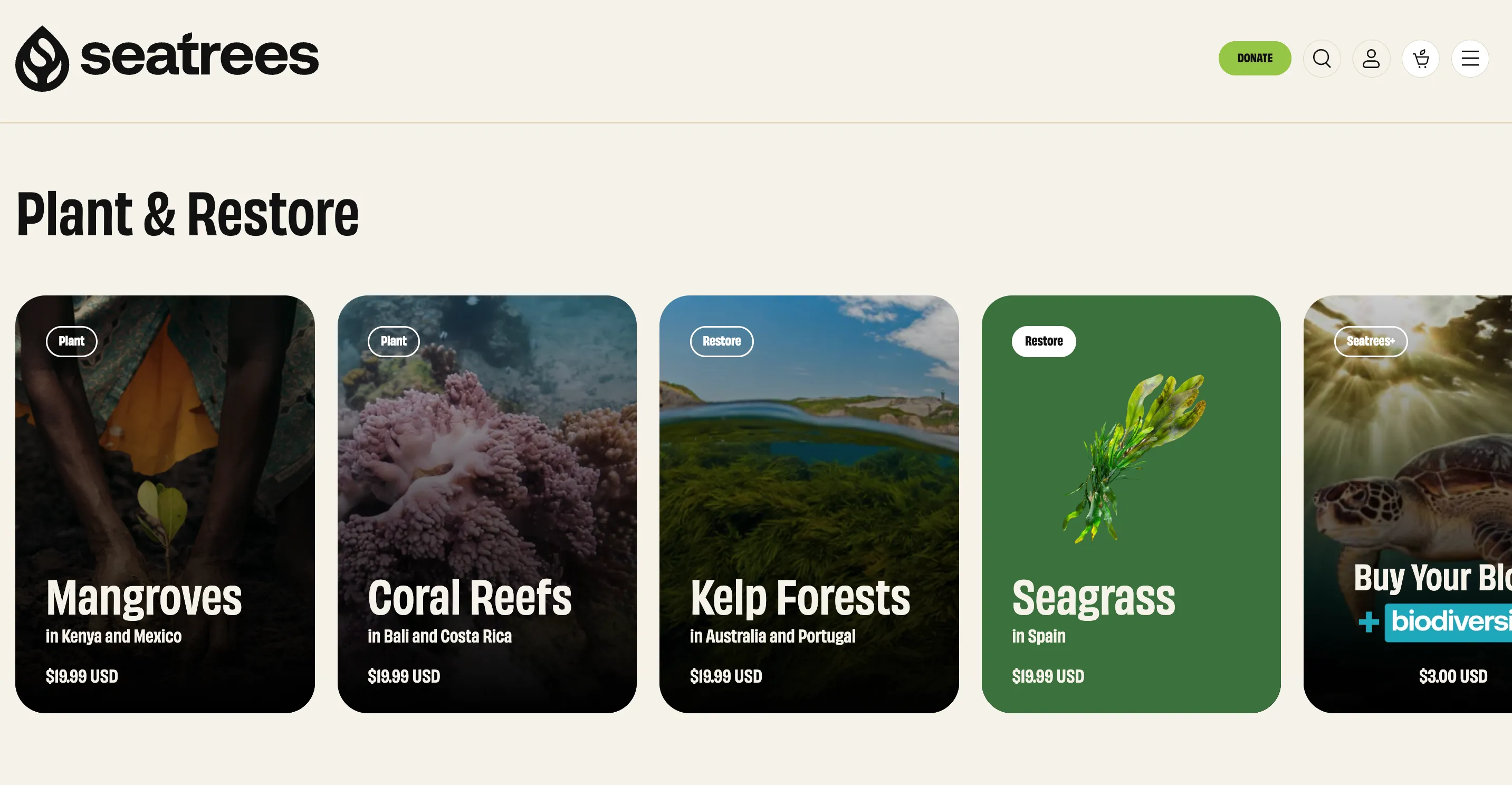
SeaTrees’s muted cream-and-olive palette, bold typography, and circular logo appear uniformly across navigation, product listings, and callouts.
Imagery is mission-driven and emotionally rich. Close-ups of mangroves, seagrass, and local stewards create continuity with their ecological purpose. Each project card uses a clean layout with bold white text overlays, reinforcing visual identity.
Even the copy aligns with their tone: calm, hopeful, and direct (“Help us turn the tide on climate change”). The overall feel is immersive and mission-anchored, helping users quickly recognize and trust the SeaTrees brand.
Source: https://seatrees.org/products/restoration-donation
10. SEO and Content Strategy
- Incorporate relevant keywords and structured content for better search rankings.
SeaTrees builds SEO strength through a clear content structure and keyword-rich navigation. Categories like “Reforestation,” “Coastal Watersheds,” “Kelp Forests,” and “Mangrove Restoration” match common environmental search terms while also defining user pathways.
- Regularly update the site with engaging and informative content (blog, news, events).
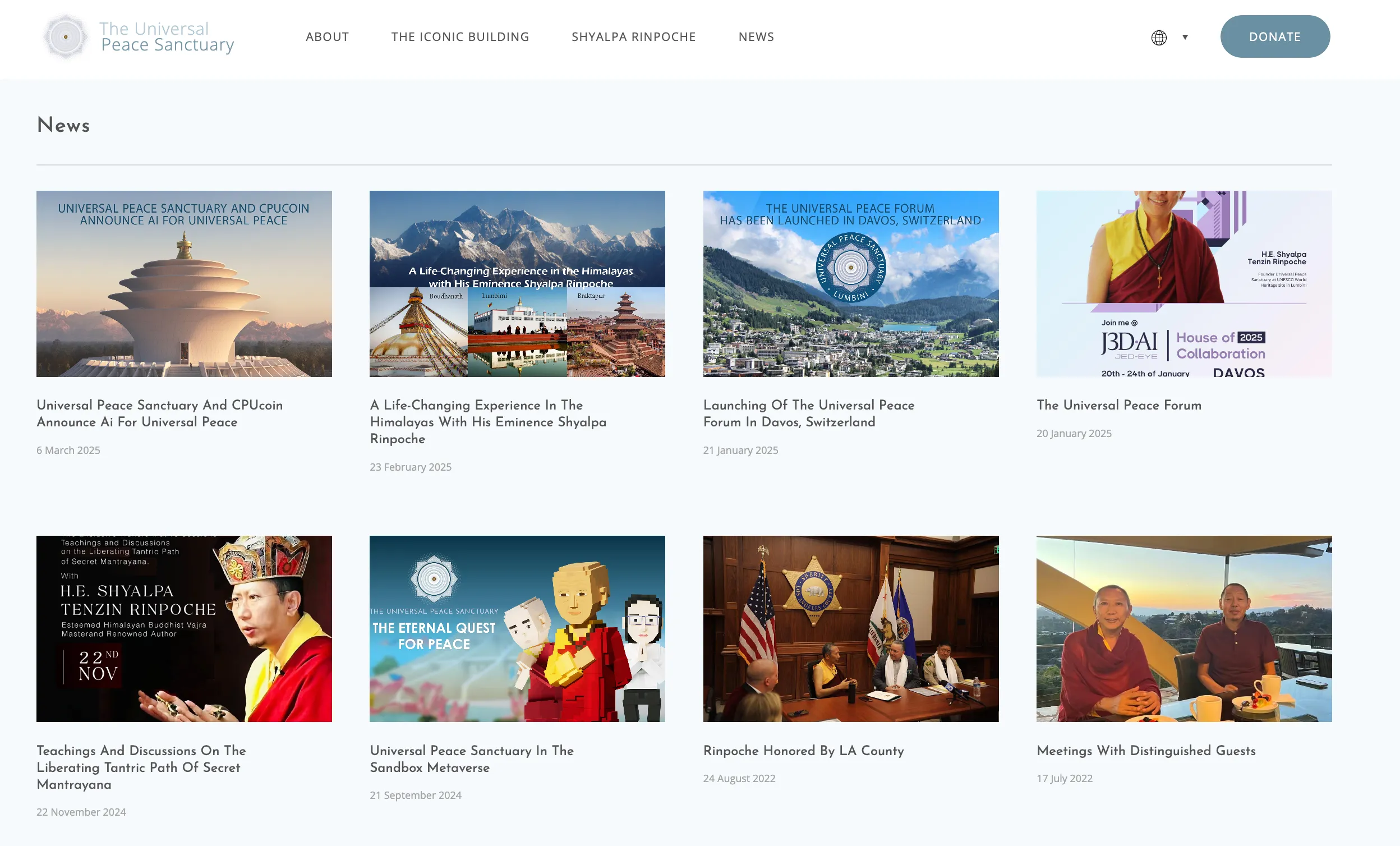
The Universal Peace Sanctuary has an active News section that highlights key organizational updates, events, and leadership activities. Blog posts like “Launching of the Universal Peace Forum” or “AI for Universal Peace” help drive organic traffic through long-tail keywords, while also reinforcing mission-aligned messaging.
The use of featured images, structured headlines, and publication dates supports both readability and search engine indexing. Regular updates help maintain relevance in a digital landscape where content freshness matters for visibility.
Source: https://peacesanctuary.org/blogs
11. Performance and Speed
- Optimize images, code, and hosting to ensure fast load times.
- Regularly test and monitor site speed for both desktop and mobile users.
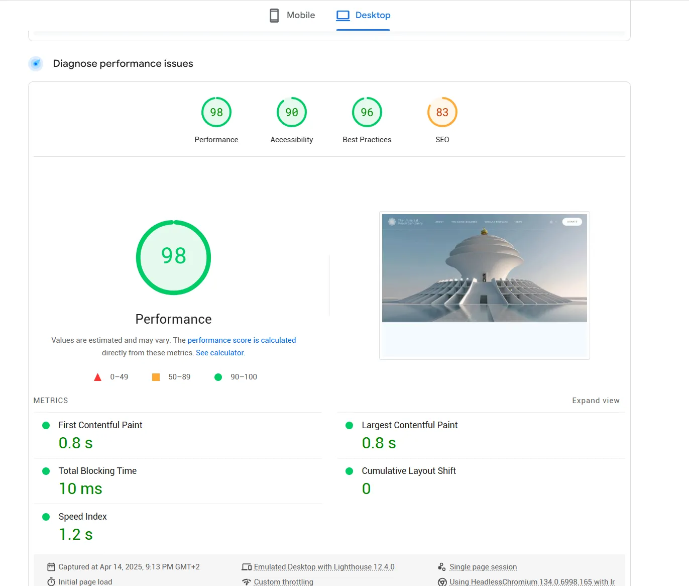
The Universal Peace Sanctuary demonstrates excellent desktop performance, scoring 98/100 overall. Key metrics include a 0.8s First Contentful Paint, 0 Cumulative Layout Shift, and just 10ms of blocking time—showcasing a well-optimized, responsive site with near-instant load experience.
Source: https://pagespeed.web.dev/analysis/https-peacesanctuary-org/khqnrx4de7?form_factor=desktop
12. Easy-to-Find Contact Information
- Clearly display contact details and social media channels.
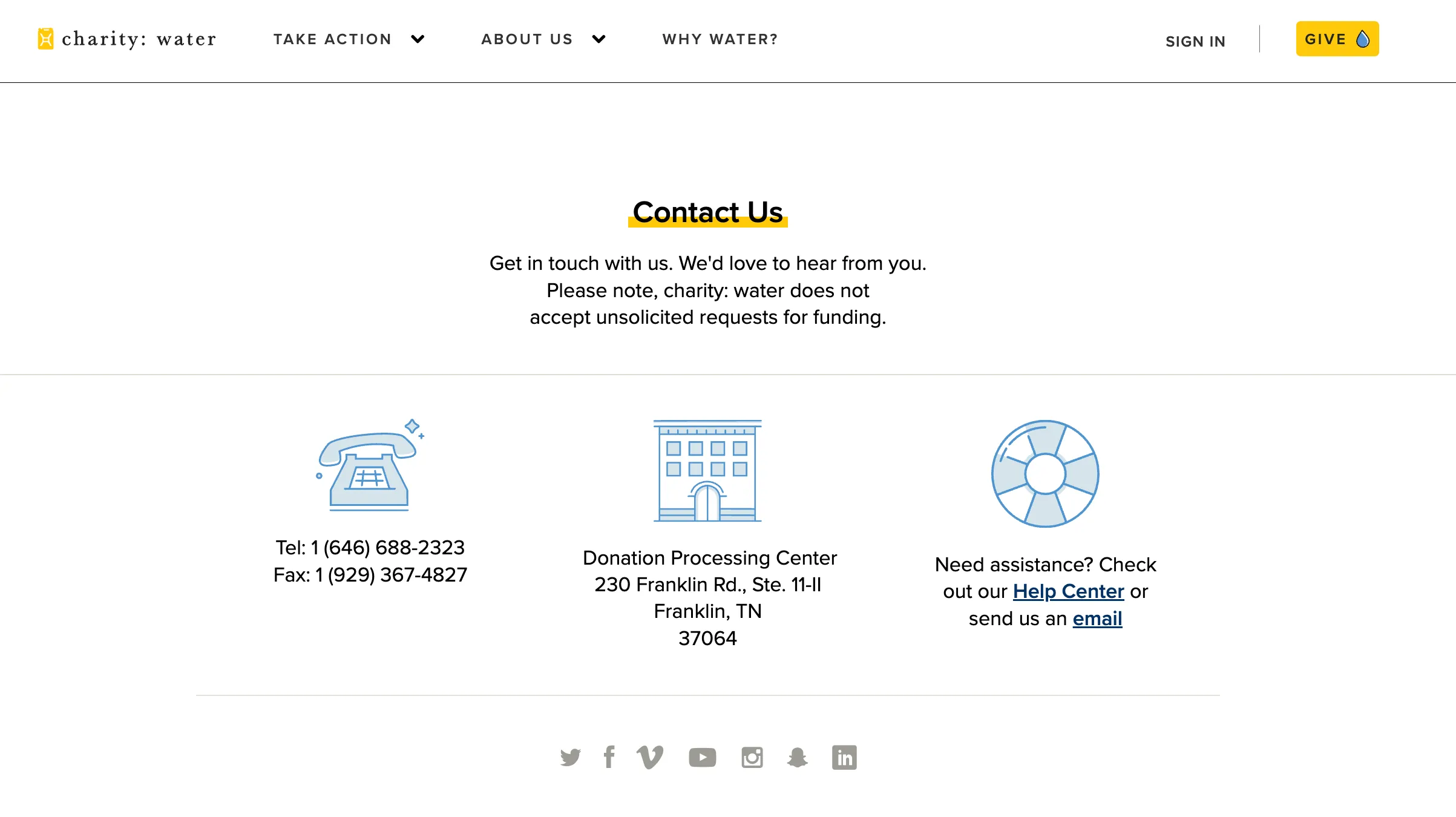
Charity: Water provides a clear and globally accessible contact section, including phone, fax, mailing address, and links to their Help Center and email support. This level of openness, paired with iconography and simple language, helps users from various regions reach out with ease.
Although not multilingual, the structure is friendly to international audiences by including multiple contact channels and physical location data, which fosters trust and accessibility.
Source: https://www.charitywater.org/contact
- Include an FAQ or help section to provide immediate answers to common questions.
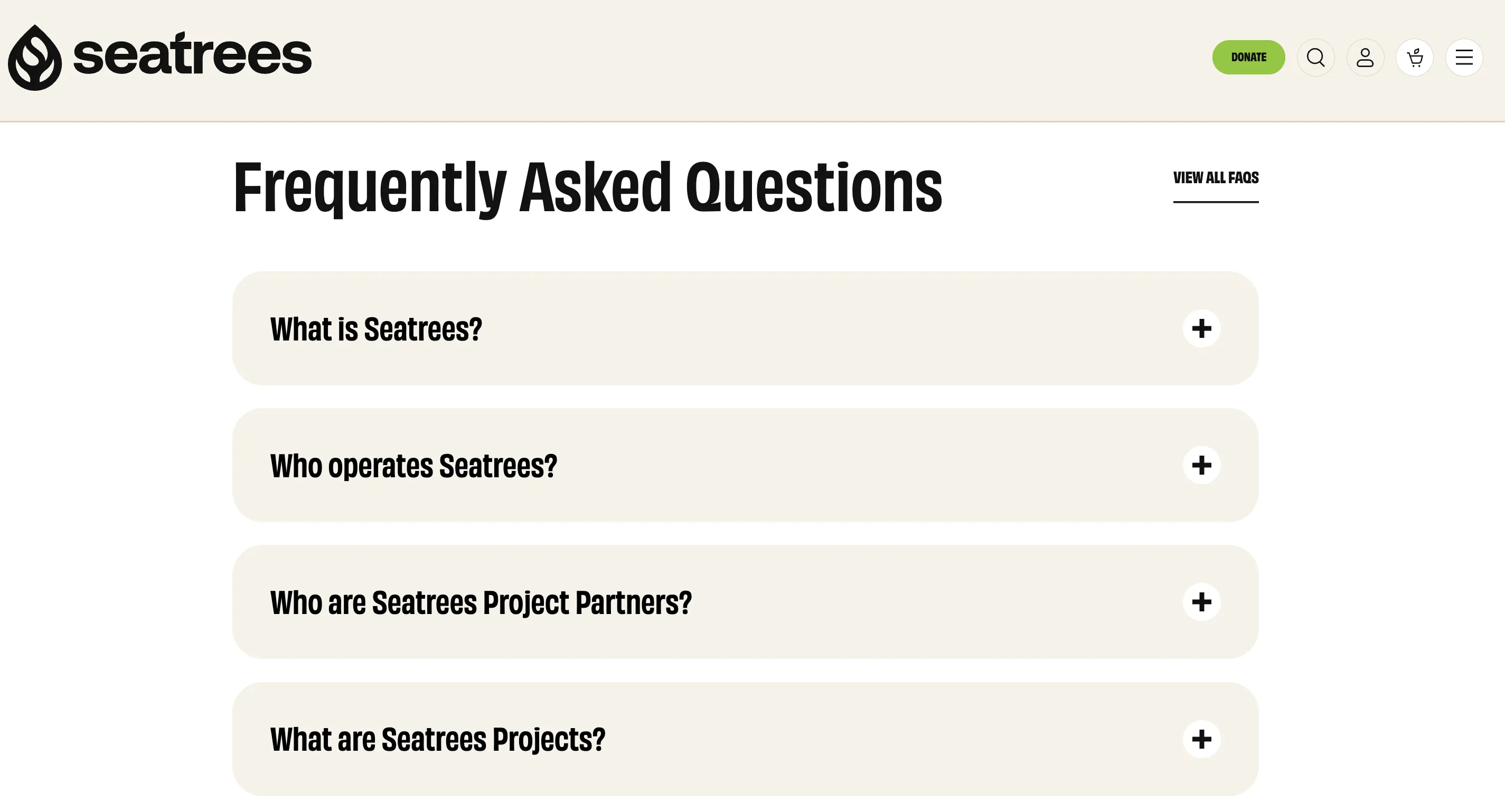
SeaTrees offers a streamlined FAQ section with collapsible dropdowns that address common user questions like “What is SeaTrees?” and “Who are the project partners?”. The accordion layout keeps the page clean while allowing users to explore only what they need—boosting clarity and usability.
This design not only reduces support overhead but reinforces credibility and transparency in a self-service format.
Source: https://seatrees.org/pages/contact
13. Integrated Social Media and Newsletter Signup
- Embed social sharing buttons prominently on content and program pages.
- Encourage email subscriptions through simple and clear signup forms.
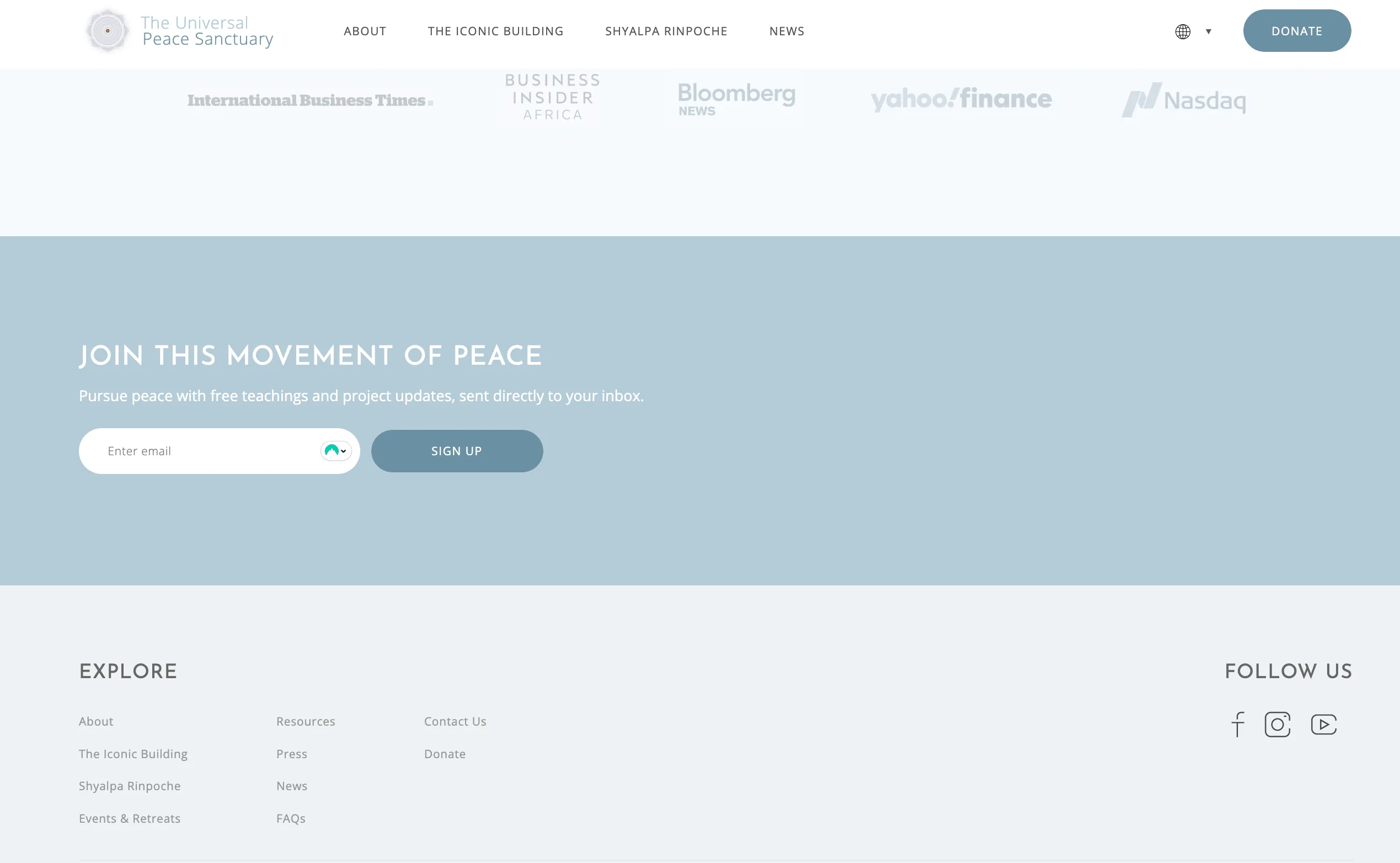
The Universal Peace Sanctuary integrates a minimalist, centered email signup form that invites users to “Join this movement of peace” with calm, aspirational messaging. The placeholder text and single CTA button keep the experience frictionless.
Just below, clean social media icons for Facebook, Instagram, and YouTube offer passive but accessible community connection options, ensuring users can engage through multiple channels.
Source: https://peacesanctuary.org
Conclusion
A well-designed nonprofit website does more than just look good; it builds trust, tells a story, and makes it easy for supporters to take action. By applying UX best practices that prioritize clarity, accessibility, emotional connection, and conversion, mission-driven organizations can extend their impact far beyond the homepage.
Whether you're looking to increase donations, grow your membership, or mobilize a movement, every design choice should support your mission and your users' goals. The nonprofits we admire show that with the right digital experience, even the most complex causes can feel personal, urgent, and achievable.
At Charly Agency, we specialize in designing websites that turn purpose into performance. We’d love to help elevate your Nonprofit site to the next level.
